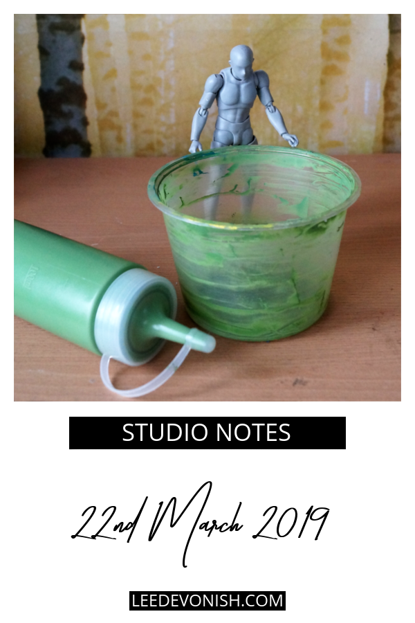
Like I said last week, the colours changed on me mid-printing, which was unexpected, but I ran with it and ended up with something more ochre-tinged than froggy green.
Because I took my photographs late in the day on Sunday, I lost the light I needed and basically ended up with a blueish cast after colour correction – or I should say, after attempting colour correction.
So yeah, I’ll have to take some new pics but I just had to get them uploaded there and then, because I knew the start of the week would be too busy and it would end up taking months.
There has naturally been a lot of visual notetaking and recording over the course of the money project, and I found that starting a sketchbook helped me to get to grips with the processes and track the progress.
I don’t naturally gravitate towards working in sketchbooks, as I like to work on loose sheets, and do a lot of 3-d work as well… so sketchbooks always seemed to be just tarted up scrapbooks, which I couldn’t be bothered with. Still, I realised last year that I needed to start one just for the money in order to sort out the clutter in my head, and guess what? I really enjoyed putting it together, and it totally paid off.
Now, the challenge is to sort through the past few months’ tests and scribbles and decide what makes it in and what goes into the bin.
Dilution, and other roadblocks to getting art done
On Thursday I was listening to the Escape Hatches episode of The Accidental Creative podcast. One part of it made me stop – the second “escape hatch”, dilution. You can get there at about the ten minute mark.
Was what I always thought of as “shiny object syndrome” really just a way of diluting my commitment and rationalising underperformance? Maybe – I am very open to analysing myself in that way, as long as it’s helpful and not just something to make me feel generally annoyed with myself.
Recently I’ve made a lot of progress with saying no to things and turning down work that doesn’t pay off in terms of what I want to get done in the long-term; so I want to keep that going by taking a little bit of time to wrap up some of the small, niggling projects that don’t count towards either the figurative images or the money project.
Just a few things like making new cardboard box shelves and making some Japanese stab-stitch notebooks and notebook covers – not practice-related, but things that I’m curious about and want to hold in my hands!
Then I’ll have all the time to focus on the two (or, let’s face it, three) projects that I love.
When I first started thinking about making an artist’s currency, way back in 2014, I thought about it both taking the form of coins and notes. Along the way, it was clear that most artists’ currencies take the form of notes, and it’s easy to understand why.
Notes are far, far simpler to make than a metal coin. The first banknotes were just written promises to pay a sum of money, after all.
Notes and coins are both immediately part of the language of money, but notes carry the connotation of high value. The exception is in the US, where their single dollar is still a paper note… but the US’s cultural capital is so strong that it’s made sure that the visual shorthand for money takes the form of a greenish paper bill.
So although I wanted to create both coins and notes, a paper bill had to form part of my currency, no question.
Why screen print the 100 banknote?
Printmaking is the technique that one would obviously turn to when aiming to reproduce currency – because there would have to be several of the same notes in “circulation” – and etching is the printmaking technique associated with banknotes and with money in general.
Just because I wanted to create a banknote didn’t mean I wanted to copy a banknote… I also wanted to evade expectations somewhat. Give a bit here to the accepted concept of money, take a bit away there.
Screen printing is a very interesting technique, as it can be dead simple or ultra-complicated. Multi-colour screen printing is difficult to perfect without a professional system for registration, so getting perfectly identical prints was always going to be near impossible. I liked the idea of the human touch coming through the attempt to mechanise the process, with all of the “flaws” – misregistrations, bleeds and fading – form an essential part of making each note an individual work of art.
Also, there’s the fact that I feel as though the medium of screen printing is part of my personal artistic practice. There are lots of things I like to do and to try, but only a few I think of as “what I do”: painting, screen printing, ceramics and sculpture.
Elements of the visual language of money: colour, shape and symbolism
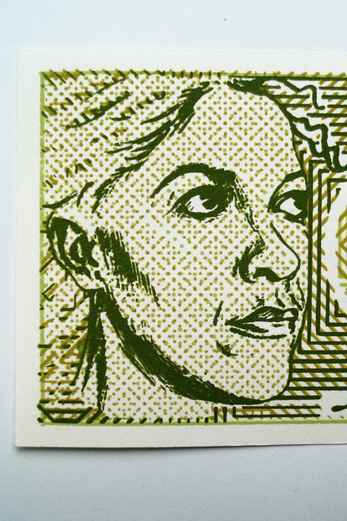
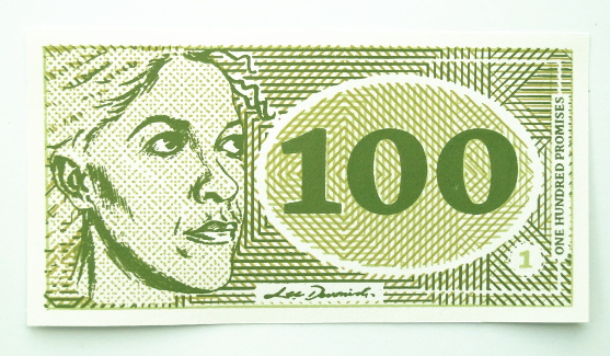
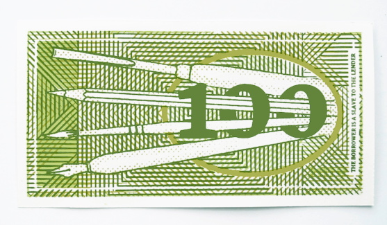
I stuck with the immediacy of green. For the first banknote I would make, I had to keep it simple; this is an artwork made to illustrate a concept, and it had to speak out the concept clearly.
Although I initially planned for the piece to take on an overall more pea-green, but not quite Kermit, tone, things got derailed one-third of the way through the printing. I decided to incorporate a more olive-toned palette
The same thing went for the shape and general format of the portrait. It may seem as though I was immediately working with lots of design constraints… but in the beginning stages I planned the note to be square, just to mess with our widely-held ideas of what money should look like. That just didn’t feel right though, so rectangular it was.
What I did particularly want to play with was the abstract patterning on the notes. I just love geometrical arrangements and started to experiment with the idea of optical mixing by overlaying printed acetate sheets in a kind of “lite” op-art.
Layering a couple of half-tone screens on top of each other gives each note a unique patterned effect, as each one can look very different from the other if the alignment is changed only slightly.
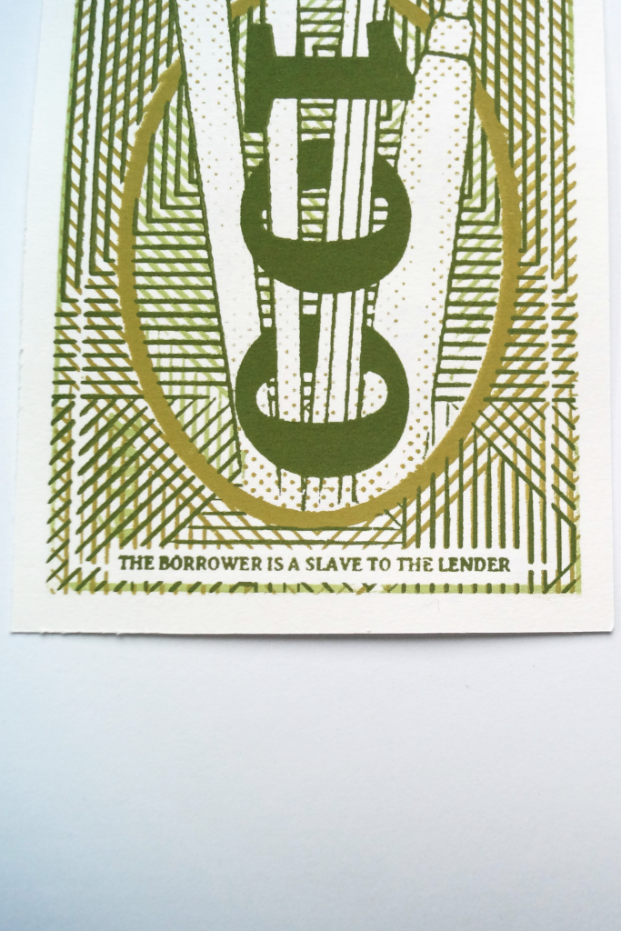
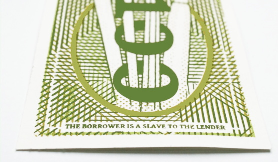
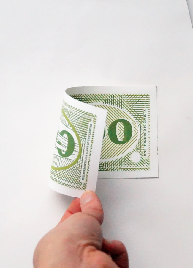
100, rear detail – “The borrower is a slave to the lender.”
The back side of the note features four tools of the artist’s trade – the pen, brush, pencil and gouge, referencing the variety of media in which I work. I’ve taken on this motif as a kind of identifying crest, repeating it in my pewter 250 coin… and it’ll be a repeating feature in other coinage and notes.
The back of the note features a quote from Proverbs 22:7, saying, “the borrower is a slave to the lender.”
The symbolism of 100
The denomination was always going to be important. As a central part of a larger body of work, this piece had to carry the anchoring number, and it had to relate closely to its value as an artwork – so in that sense, it chose its own denomination of one hundred.
One hundred what? This is the first of my money artworks to explicitly carry the name of my currency as “Promise”, although that is inferred as the title of my screen printed cheques.
Why promises? Well, the value of all currencies are in what they promise to give you in exchange. The money itself isn’t really any good to you; it’s what you can exchange it for when you need to exchange it. It’s the promise of transforming itself into something else, whether that’s a loaf of bread or a tank full of petrol.
If you have the nerve to put your face on something and assign it monetary value, then you’re making a lot of promises.
How it was made…
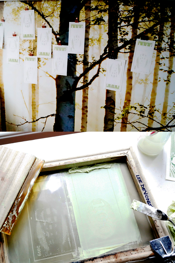
The images were mostly hand-drawn and repositioned by extremely old-fashioned cutting and pasting, with a lot of photocopying to resize. It’s left me with a sketchbook full of copied pieces and variations, which is interesting in itself.
Of course, I realised after doing most of this that I should have designed it all on a computer instead for pinpoint accuracy, but the fact is that the handcrafted element does reflect my personality and working style. Will I adapt to take on faster methods? Absolutely! But this piece has had a lot of hand-work put into it, which makes it special to me.
The piece is a 3-colour, double sided screen print, which is a technical challenge – 6 opportunities for something to go wrong! Actually, there were seven pulls in all on each note, as the note’s number is added afterwards with a separate screen.
Each colour had its own unique screen which was printed light to dark. Several different papers were tested for their colour and handle, but I selected a light cartridge for its bright white colour and flexible handle – the note is meant to be held as well as looked at!
Overall it was everything I enjoy in my work – a technical challenge and a deep concept to dive into.
When you’re thinking about being productive and/or successful as an artist, it really helps to look at the big picture. I tend to worry about not getting enough done from week to week, probably because I know I’m going to come onto this blog and confess every Friday.
But that weekly cut-off time frame doesn’t matter, really; it’s an arbitrary limitation that I’ve imposed on myself to help myself. It spurs me on, even though absolutely nothing will happen if I don’t make any art or if I don’t post about it. *crickets*
This week I’ve attacked the work. It’s been hard to make myself stop long enough to write about it, actually! And all this after moping last week about not getting enough done – the thing that worked was turning up, doing a few materials tests, and letting the little embers catch fire.
I made a mistake…
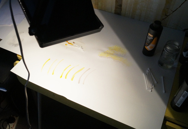
Last year I knew I couldn’t go straight through the process and print my notes, because I had to have surgery. So I did the next best thing and got all my prep out of the way – I mixed up all three of the colours I would need, and tested them out. Great, right?
Feeling prepared – my first mixed colours
Well, when I did that, I ended up re-mixing the lightest colour, as colour no. 3 was too close to colour no. 2. That means I ended up with four bottles of ink.
Of course, three months on, I picked up the rejected colour and started a full run of prints, and only realised what I’d done after getting through most of the first side!
That meant I had to totally reformulate the two colours that came next, which was a waste of time. But… after having spent time this week listening to a podcast episode about sunk costs, I was happy to brush that off and work on making my second round of colours better than the first. After all, I knew the first iteration wasn’t amazing, so this was a chance to shoot for that!
My drying and printing methods are quite basic.
More about sunk costs…
I found this to be such a motivating concept, and one that I think needs to be broadcast to artists as well as economists. It gave me the kick to clear out the corners of my studio that had become a shrine to the 5+ year old class notes and projects that I didn’t really want, but had once put a lot of time into. Into the bin, and I feel fine.
So I’m sure I’ll be writing more about that, eventually.
I really, truly hate to say that, as I think it’s so commonplace and it’s something that I’ve gone through and defeated before, and I can already see its cyclical pattern laid out before me: it comes and goes, and I get that it’s absolutely pointless to fret over it.
Backing up – the return of a shelved project
So why
slip back into feeling swamped? Well, I was listening to a podcast whilst
tidying up, as I often do, and this one happened to be about increasing
creative productivity. I wasn’t going out in search of self-flagellation, I
promise – I just cycle through different podcasts for creatives and for
marketing, and this one popped up.
It was
great, actually – engaging and thought-provoking, and it pushed me into
reconsidering my timeline for the course I’m writing. I should say, into
reconsidering the fact that if I don’t start writing this course as a priority
it won’t be finished this year.
Fast
forward through the buzz of that evening to the grim reality that the course is
not a simple project at all… cue feeling swamped and overwhelmed.
Writing the course I want to take
I’ve been
through plenty of art education, and I can see a lot of low-quality courses
bandied around online.
There are
even more blog articles telling you that you can easily create a course and
earn passive income from it. This is the problem – a lot of low, or at best,
mid-quality content encouraging you to create low or mid-quality content as a
course. Actually, the same goes for ebooks. I think that if you want to write
and publish a book in a week, as I’ve seen suggested online, you should accept
that you’ll be writing and publishing a bad book at best, or more accurately,
an assortment of related articles.
This
really isn’t something I’m happy to do, but I’m not happy to sit on my idea for
much longer either. I feel as though I need to make this a priority just so
that I can get it off of my shoulders and carry on with the artwork that I had
to shelve at the end of last year.
What I
want to do is to write the course I would want to take, and to write the book I
would want to read. Sounds good, but both of those things have to be, for me,
substantial and specific, high-quality offerings. The kind of things that
require time and research, and a lot of focus.
What I’ve done to get unstuck
Nothing gets done via hand-wringing and worrying.
One of my first jobs this week was to start cleaning and organising my studio, as it had been neglected since my enforced break at the end of last year. This will help with absolutely everything – being able to quickly do some work in some stolen time or find the resources I need for a job.
Another was to organise my existing course/book notes, see
what I already had and what else I needed, and come up with a writing plan.
So far, the plan is to flesh out the existing headings into
chapters and write the entire text as I would write a book. When the first
draft is done, I’ll see if I can package it as a course by recording it. After
that, I’ll add to the text, then refine and edit it into a full book. If it’s a
bad book, then I’ll make it better. Simple plan.
What helps me to stop freaking out is that part of the plan is only looking at the steps that are right in front of me. Writing a book is a big deal; writing ten thousand words is less so, but writing one thousand words about one single topic is not as terrifying.
Also, I learned that I really like writing notes longhand instead of typing them.
Testing the Solarfast dye under a lamp.
Doing the work
It never ceases to surprise me, just how easy it is to actually get on with the work. Sound strange? Well, I find that thinking about doing something is invariably more stressful than the task itself actually turns out to be once I get started. I managed to start testing my Solarfast inks with the screen printing thickener and come to the conclusion that this was absolutely not the right medium for the money project.
The great thing about this is that even though my tests didn’t turn out as I wanted, the way forward with the inks I mixed and tested in December is totally clear and I’m not left with any niggling doubt as to whether I should try something different.
I’m going to keep the same train of thought for the writing. Just sit down and do the work, even if it’s just a tiny bit, or just to answer that small nagging question. It’s rarely as hard as you imagine it to be.
It’s been a busy creative week, but most of my creativity has gone into writing, which, when I sit down to write about what I’ve done, makes me feel awkward about not hitting the goals I had in mind.
On the other hand, looking back at where my time has gone made me realise just how much has actually been done.
Feeling slightly dissatisfied?
This week I’ve been less artist than writer, businesswoman and agony aunt.
In the last week, I’ve worked on eight articles and published six of them, with the other two due to go live in a few days. In some cases, creating the visuals for the articles has taken longer than preparing the text.
These all live on platforms I built from scratch and control myself. I worked hard for a few years to get to the point where a blog could earn me money and now can say I earn money from my writing on my own terms.
Not bad, right?
Yet I still find myself feeling bad because I haven’t been able to work on the newer projects I wanted to. Today I’m trying to work around that by writing it away.
I’ve created a communication machine
One morning when I had planned to plough through some writing, I got an email from a reader, asking for advice.
This was on a different site, on a subject that’s very difficult and very stressful. Whenever I get reader emails on this topic, I try to reply straight away, but a good, detailed answer can take a long time to put together.
I feel good about being able to earn from my ideas and my words, but I feel great about being able to use my ideas and words to provide help for people who need it, who feel as though they have nowhere else to turn to. I only wish that I could do more to help, but in truth there’s only so much that I as a writer can do. Still, when you think about it, that blog has touched more people than my art has…
That doesn’t mean I’m ever going to ditch creating art, but it does mean that I can start to feel good about weeks when the writing takes over.
When the writing starts to feel like a machine that I’m tied to, as it does from time to time, then it’s time to step back and take a look at the machine that I personally created. It’s mine, I can do what I want with it, and it helps people.
It’s still creativity, just not in the marks-on-paper sense.