Today I’ve made myself a little proud and practiced what I’ve preached. Keeping a creative life alive when you’ve got a hectic schedule is difficult, and I’m no different from any other parent who has the full range of grown-up responsibilities. The only difference is I’ve given myself an additional range of creative tasks to potentially get frustrated over!
If you can’t fit in a big project, do something small that’s a step towards it.
I’ve known this for a long time – some weeks there are just too many things in the way to dive in to a time-consuming project. This week was just like that.
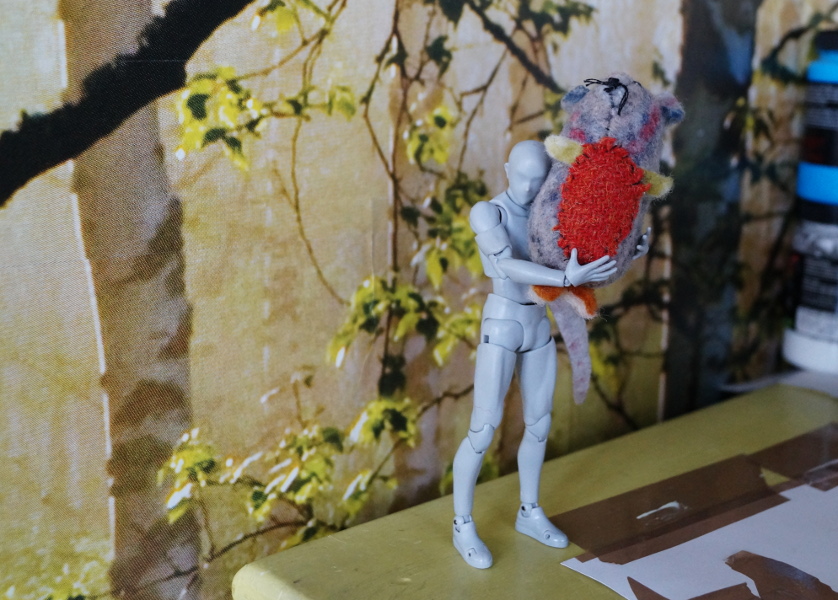
I did have a great creative result as an art technician though, designing a minimal sheep’s skull mask template for a dance performance. I’d planned to recreate it and document it for the blog this week, with a pdf to share. I haven’t been able to do that, but I’ll make sure to get on to it as soon as I can.
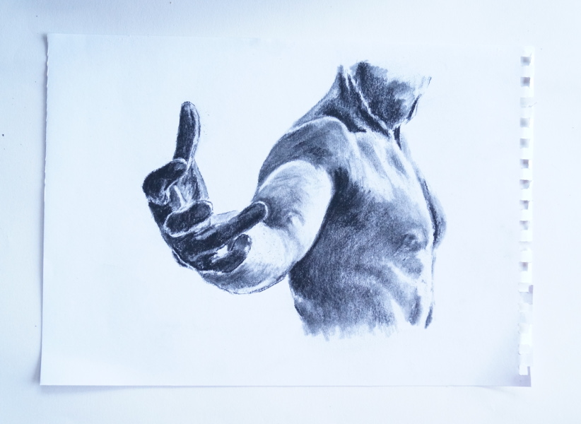
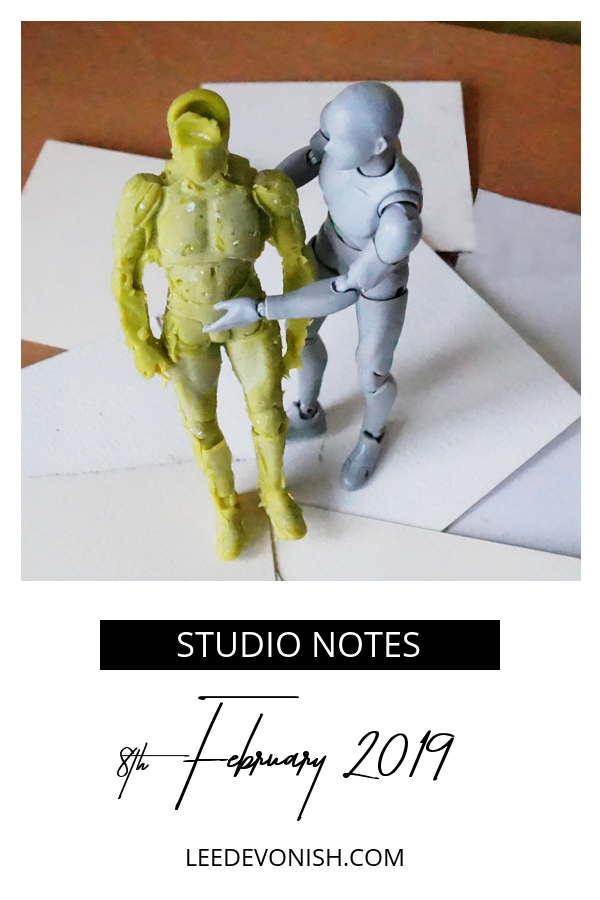
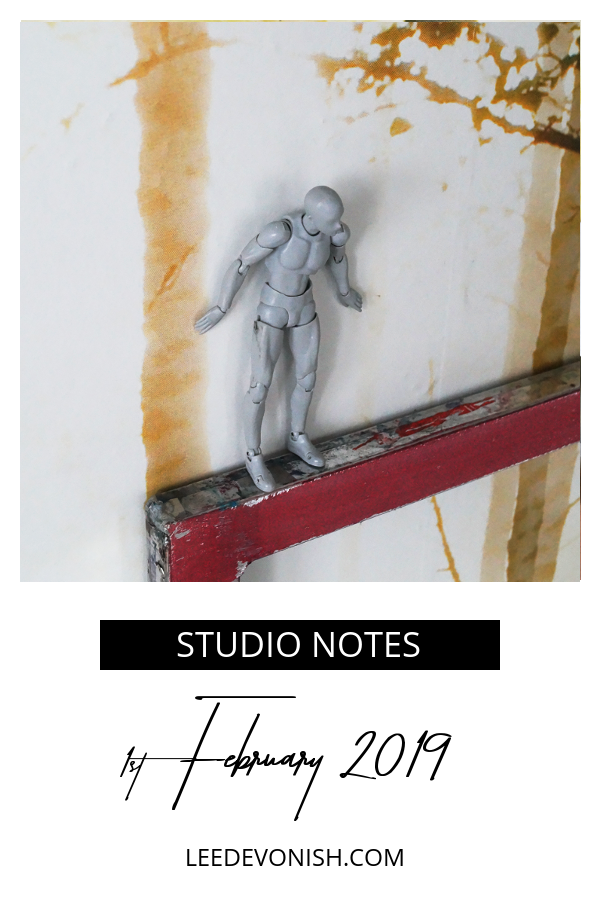
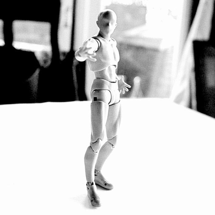
The main thing I’d wanted to do was to carry on one of my ideas from last week when I worked on a backlit drawing of Ste. I wanted to set up some photographs going 360° around him, then translate these into drawings and maybe paintings.
Next, I wanted to try animating the drawings (William Kentridge is the first influence to come to mind, of course).
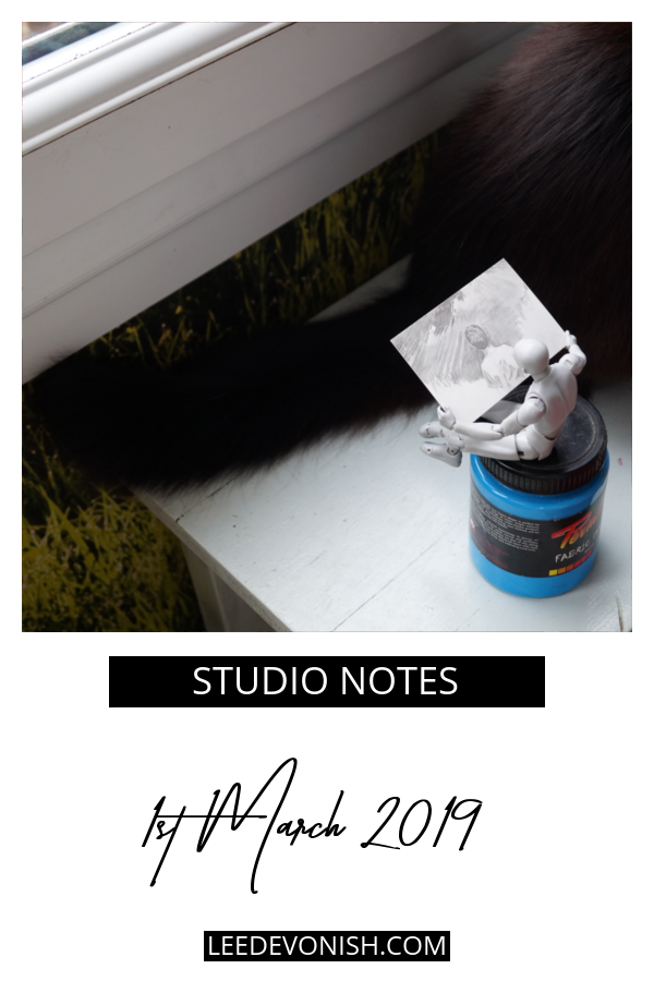
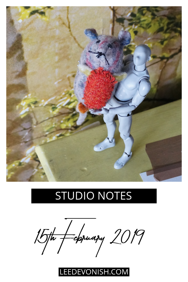
With everything we had to manage this week, there just wasn’t time, so I used my studio assistant (which is the entire reason why I bought him in the first place!). I took some quick snaps, but I just couldn’t fit in the drawing stage for the scope I had in mind, so I made a little video and then a gif from my stills.
Small steps can take you in the right direction
So this wasn’t what I wanted to have done by the end of the week, but having a deadline (this post!) and a strong desire to have something – anything – as a visual note meant that I have a step towards the end goal.
I particularly like seeing the answers to some of my questions, such as:
How would it appear – as if the subject is moving, or if the observer is moving?
What effect does the light source have on that – moving around the model instead of moving the model?
Anyway, now I have something that I can look at and show to others to demonstrate the concept I’m thinking of expanding on, and that takes me further along than if I’d done nothing at all.
Not getting distracted…
Of course I’m interested in animation, but I can’t commit to another rabbithole! This is definitely something I’m going to pursue, but I have the money project to get on with as well as a few writing jobs to complete.
If you get stuck with your own creative process, try to tackle a smaller step, and pat yourself on the back for what you have managed to accomplish. It definitely helps!