I got that push to finish and publish my second journal, and do you know why? Because I made a massive mistake with casting my coin and had to do something with myself while I was waiting for more silicone to arrive.
It seems as though I’m mostly reporting on huge failures, doesn’t it? Well, that’s what it feels like to me sometimes!
Still, at least I have enough to get on with to fill in the gaps when things don’t go perfectly.
Mould making, the right way
Confession time – I know how to make two-part moulds, and I know how to make even more complex, multiple-part moulds. I’ve been doing mouldmaking for 20 years now, so I have a handle on the basics… so what the heck is up with my recent run of catastophes?
The simple answer is that the silicone I’ve been using has given me the option of being lazy, and faced with that option, I’ve grabbed at it with both hands like a desperate woman.
Why lazy? Well, you can cast a solid block and then cut it apart, unlike with plaster. Working that way around, what happened was that my pouring spout was too narrow to accommodate an adequate flow of silicone, so with an 8 minute pouring time, I ended up with a lot of silicone that had gone off before I could use it.
Fast forward a few days and another batch of silicone, and I made the mould the right way. Don’t be lazy, kids.
Prepping for a new casting project
I’m not just working on the coin, though. I’ve got a plan for my soap base in mind, and my poor plastic artist’s assistant is getting roped in as a model.
Right now I have to pull up the handbrake on work though, as the studio contents have spilled over (in some cases, literally) to the rest of the house and I have to scoop up all of the leftover silicone that’s been chipped up for recycling and clean off all of the wax I tipped over the cooker and the kitchen floor yesterday…
Will I get to cast the pewter next week? Maybe, but maybe I’ll work on prepping the rest of the things I want to cast at the same time. We’re looking at getting or making a casting flask for sand casting, so I may work on that instead.
Following on from my previous post about fonts for painting, I wanted to put together a list of my favourite typefaces that are reminiscent of drawing styles.
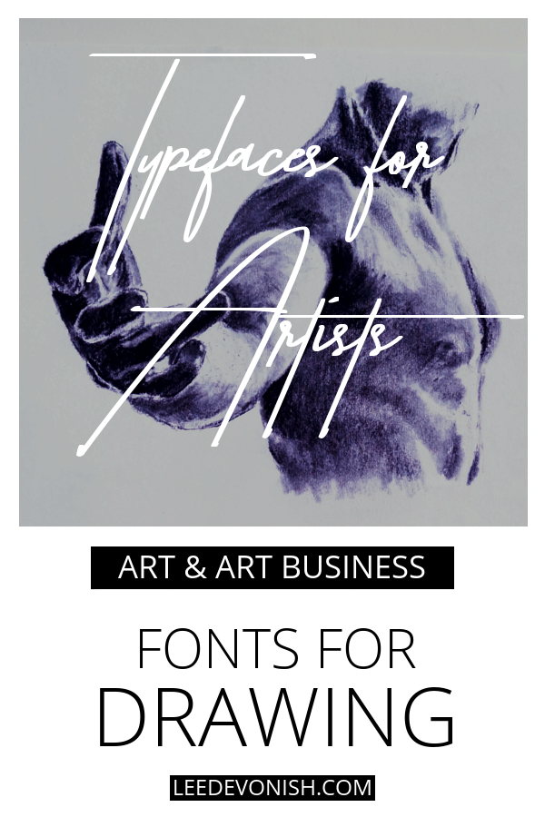
Typefaces for artists: fonts for drawing
Typefaces for drawing often draw on (sorry) a particular style of broken or wavering line quality that immediately suggests the involvement of an imperfect human hand.
Although that’s not the one and only thing that denotes a hand-drawn mark, it’s one of the features that catches our interest and tells us straight away what this typeface is about.
We think of hand-drawn lettering as honest, simple and pure: the most down-to-earth, natural form of art we can produce. So even if your project has nothing to do with art but needs to pinch some of that creative mythos, these fonts are an ideal place to start.
Macarons Font Family
Macarons is a hand-drawn font package that comes in five weights:
Macarons Light
Macarons
Macarons Bold
Macarons Sketch
Macarons Bold Sketch
There’s also a set of “catchwords” and ornaments included. I really like this typeface – it has a serious tone to its form that’s undercut by its wibbly-wobblyness. It’s as though Times New Roman stopped taking its medication.
Even better, it looks as though it could lend itself well to linocut or woodcut styles.
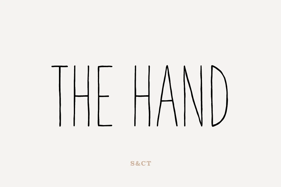
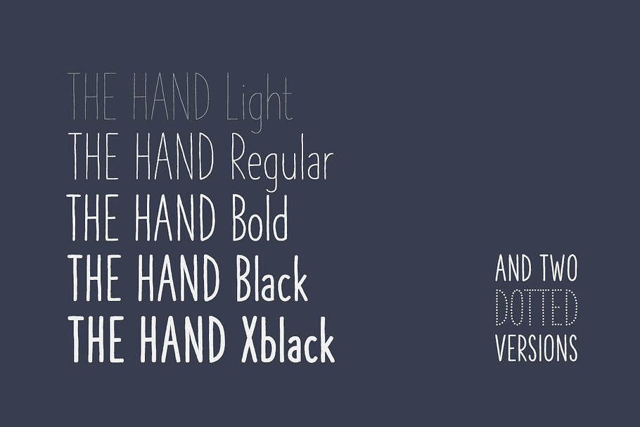
The Hand Font Collection contains 7 fonts in different weights – light, regular, bold, black, xblack and two dotted versions. That’s a great package that covers a range of styles.
The Hand Light is reminiscent of the faint trace of a mechanical pencil (reminds me of Technical Drawing at school) or fineliner, whereas The Hand Xblack gives you an impression of wielding a felt-tip marker.
The dotted versions are great for complementing stippled effects.
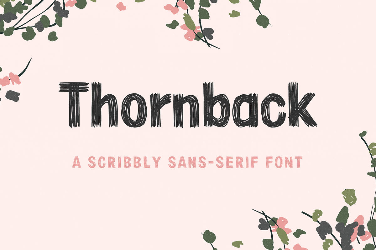
Thornback is an extremely charming scribbly font that somehow reminds me of the Sunday comics, but at the same time could just as easily be tipped over the spiky edge of anarchy.
It’s a great typeface for anyone who wants to keep it loose, but still maintain and element of control – this has both.
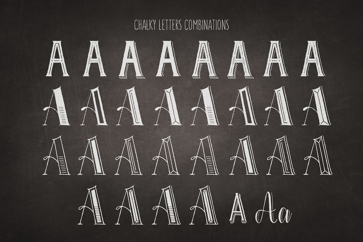
The Chalky Letters font collection has a beautiful, delicate illustrative quality to it, and it’s amazing how many combinations you can make.
This collection contains 17 fonts in all, including a set of decorative extras. It’s hard to imagine getting through all of the possible combinations!
I’m really impressed by this font package. Also, with just a bit of imagination this could be effectively used to illustrate other dry media such as pastel and charcoal – it doesn’t have to be all white-on-black.
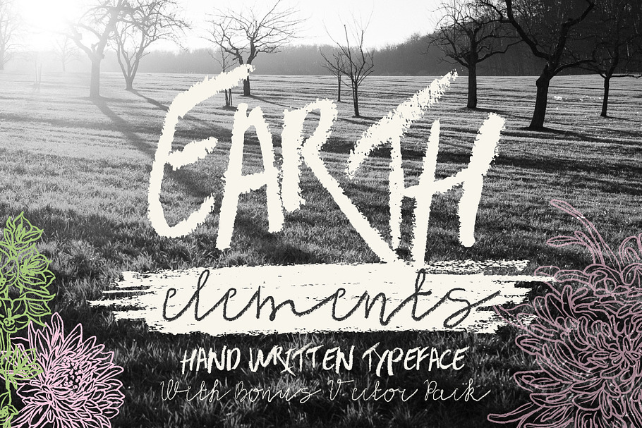
I almost bypassed Earth Elements, as the jagged lines of the chalky capitals didn’t quite grab me at first. However, once I saw the quirky, flimsy lines of Earth Element soft, the script type included in this package, I was hooked.
The soft script reminds me of doodling with a 6B pencil on not-pressed paper, and the regular script looks like a charcoal attack. It’s a fantastic duo, and the bonus vector pack has some great, smudgy elements to complement the text.
Faun is a fun, over-the-top, impressive decorative display font. It would be absolutely perfect for accompanying adult colouring books or for working alongside a strong graphic style, but beware – something this big and bold can easily overshadow artwork and steal the show, so use wisely!
I’m glad that I found Quendel Happy Family Fingertip – it’s not easy to figure out what’s going on with this font thanks to the confusing imagery which shows all four of the fonts available in this “family”, but this one is the Fingertip version only.
It’s a negative space typeface – imagine drawing with your finger on the beach, or pushing around some graphite dust on a smooth board. I think it’s really interesting and gets to the heart of mark-making.
My fonts for drawing have incorporated styles reminiscent of finger painting, pencil, charcoal, fineliner and chalk – I’m pretty pleased with that! I hope it’s helped you as well.
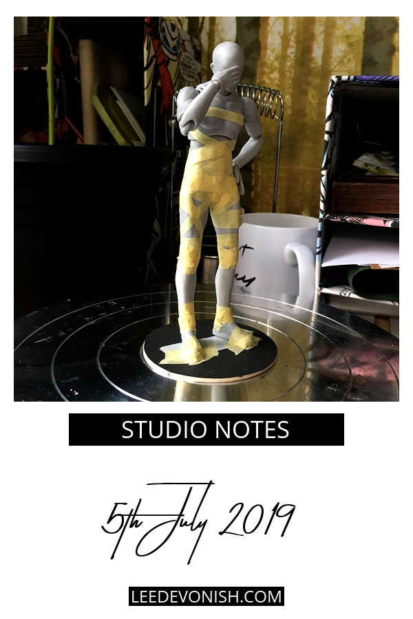
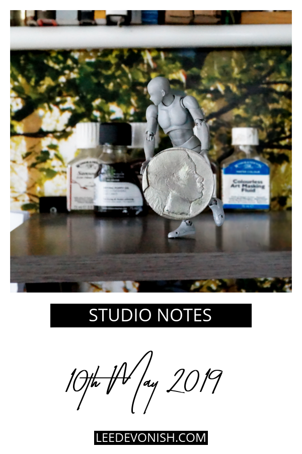
What a busy week – redesigning the pewter coin has been the most important thing, but I’ve squeezed in a few jobs on the side as well, like re-stretching an aluminium screen and prepping materials for a new miniature sculpture.
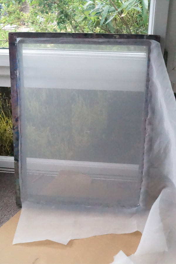
Last week I had planned to restretch a couple of screens using two-part evil glue, but when I finally got an afternoon of dry weather and opened up the bottles, I realised that the hardener had – well – hardened, and it was unusable.
My ghetto screen stretching method
All of this after I’d started the process: I tacked the mesh across a wooden frame that was just bigger than the aluminium frame, laid it on top of the aluminium frame and clamped it tightly down onto it. That would stretch the mesh even tighter over the new frame and allow me to glue the mesh and screen surfaces.
That way I’d get a very taut, professional-quality stretch in my back garden. Well, that was the plan until the glue problem, so having set everything up – clamps and all – I just went ahead with contact cement.
So far so good – I sliced the screen out of the wooden frame and it’s kept its tension, but I’m going to have to test its resistance to all the screen printing processes. And… I’m out of mesh for this size of screen, so I’ll have to buy some more before I can carry on.
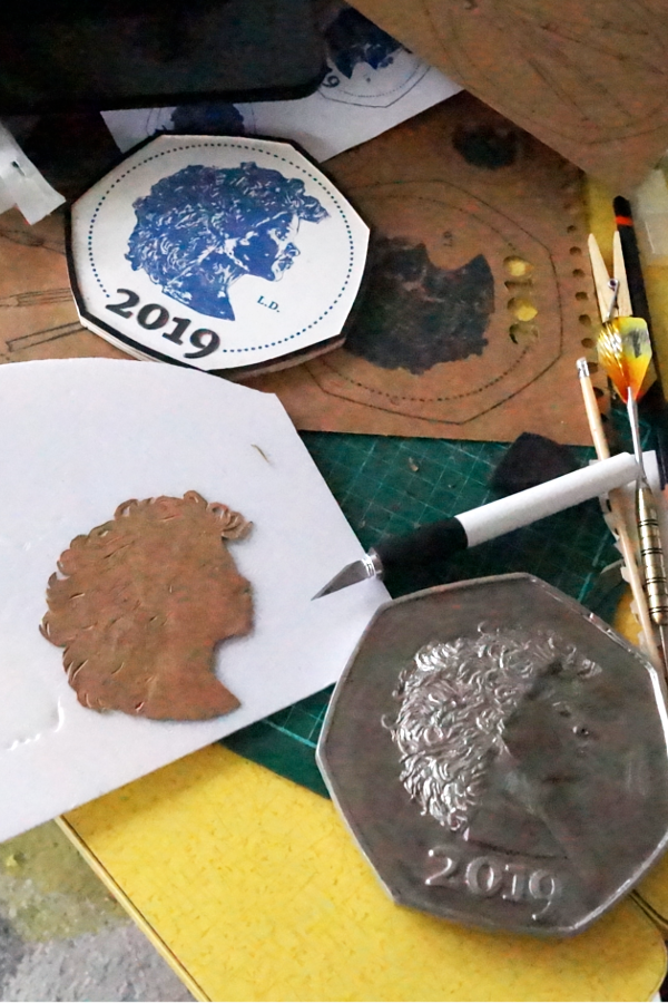
Back to sculpting the coin
When I started the process of sculpting coins last year I came up against the problem of creating precise marks in materials that don’t lend themselves to the level of precision that I wanted.
Everything I did was made the old-fashioned way: all hand carved, with the most advanced process being photocopying. This is kinda how I roll; my natural inclination is to do everything without computers, not because I have to prove something, but because that’s just how I learned to do things and that’s what comes naturally. If I’m going to push this to where it needs to go, that has to change.
The point isn’t to create industrially manufactured pieces, but to marry the idea of a hand-made object of value with that of a mass-produced symbol of value. Basically I need to upgrade my processes.
With modern coin design and manufacture, you can’t get away from computers and machines. I’ve been thinking about ways to incorporate more computer-assisted working into my practice, whether it’s getting a 3d printer or – as an alternative – a plotter cutter.
I’ve spent the last week researching these and it’s made my head spin. The thing is, they’re pitched firmly at the crafts market, and it can be hard to figure out if the machine you’ve spotted will be suitable for more robust work, or, more importantly, original work (not being restricted by locked-in software).
My plan is to use one of these to precision-cut paper layers to laminate sculptural forms. It’s not that out of the question – it’s basically how I’ve been forming my new coin this week, but by hand. Maybe before too long I’ll have a bit of help with that.
I love finding typefaces that pair up with a particular artistic medium or style – it feels like the perfect marriage between visual language and the written word.
The right typeface can bolster your brand as an artist, so it’s worth thinking about the fonts you use – here are some fonts for painting and painters.
Typefaces for artists: fonts for painting
Typefaces for painters can reflect the quality of the brushwork, the style of paint spatter, or just provide a vehicle for layering colour.
Brush-style fonts are pretty common, but not all are created equal. I’ve chosen some fonts for painting that evoke different painterly styles – hopefully you’ll find one for you.
Opulent + SVG Font
Opulent is a script font package that comes in three styles:
Opulent SVG font that allows you to render your lettering in lush watercolour brush strokes
Opulent Brush font, which gives you a ragged edge and classic dry-brushy look
Opulent Solid font, which gives a smooth edge to the text, reminiscent of a more liquid paint effect
So three fonts in the package for $20 is pretty stellar.
Express Yourself is definitely a fun typeface – made by dripping enamel paint, it really stands out amongst all the brush fonts.
This font would be great for branding anyone working with drip art or pour painting styles – or anything that needs a wild, expressive flavour. It actually reminds me of ceramic slips!
Casual Brush is a handwriting typeface that combines some internal breaking with lots of smooth lines. It does have an elegance about it, but is very informal and easy-going. A bit more illustration mixed into your painting practice, you could say.
What makes this so interesting is the sheer amount of variety you get in the combinations of over 600 ligature pairs and two stylistic alternates – there’s a lot in this package.
I love the look of this typeface – fat, luscious and happy! It does just what the name suggests – calls up paint’s liquid nature with a heap of added style.
It’s begging to be used as a logo, but this font could easily lend itself to lots of other applications.
Blackhawk seems to me to be the epitome of an edgy dry-brush typeface: all slanted, stabby points and ragged edges, and all caps. It’s fast, urgent and instantly gives you that street vibe.
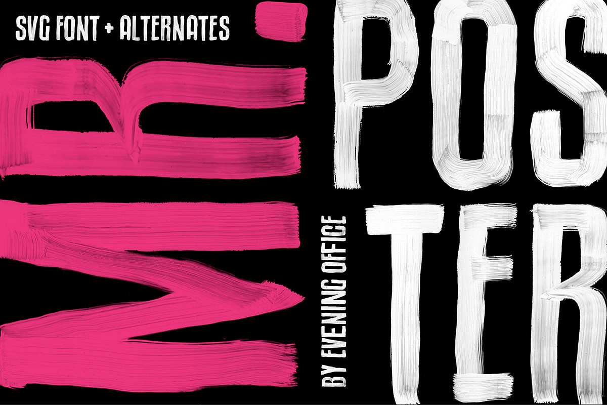
Mr. Poster is one of those incredibly memorable typefaces – show-stealing and full of character. I absolutely love it!
It’s a bit more limited than others on the list as there aren’t as many alternates available, but it still does its job. Made using acrylic paint on transparency, this font is at its best in its SVG version, but the solid vector version will still impress.
Tooth & Nail is a gorgeous handwritten dry brush typeface with an upright habit that plays into its down-to-earth appeal.
If you’re looking for a way to convey down-home trustworthiness and creativity, this is the package for you – and there are extra paint splatters and more included as vectors, which is always cool.
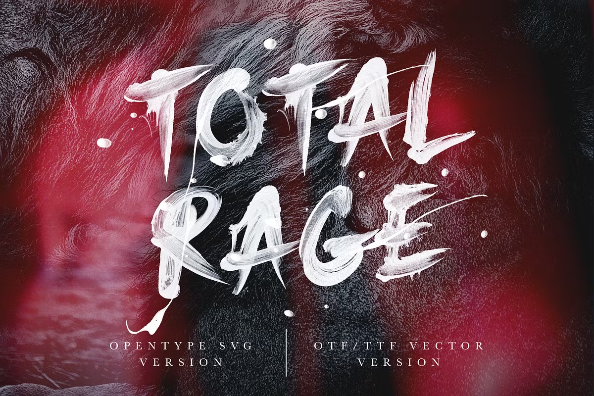
Total Rage is a font with absolutely unbelievable texture and tons of energy built into it. Gestural painting and expressionism have found their mouthpiece here!
While the SVG’s transparency is undeniably the star of the show, the vector version’s solidity makes this look totally brutal… in a good way.
So I’ve managed to find a selection that matched watercolour, enamel, acrylic, paint marker and gouache… and some that just evoke paint’s liquidity. Which was your favourite?
When I first started thinking about making an artist’s currency, way back in 2014, I thought about it both taking the form of coins and notes. Along the way, it was clear that most artists’ currencies take the form of notes, and it’s easy to understand why.
Notes are far, far simpler to make than a metal coin. The first banknotes were just written promises to pay a sum of money, after all.
Notes and coins are both immediately part of the language of money, but notes carry the connotation of high value. The exception is in the US, where their single dollar is still a paper note… but the US’s cultural capital is so strong that it’s made sure that the visual shorthand for money takes the form of a greenish paper bill.
So although I wanted to create both coins and notes, a paper bill had to form part of my currency, no question.
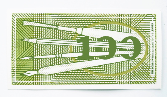
Why screen print the 100 banknote?
Printmaking is the technique that one would obviously turn to when aiming to reproduce currency – because there would have to be several of the same notes in “circulation” – and etching is the printmaking technique associated with banknotes and with money in general.
Just because I wanted to create a banknote didn’t mean I wanted to copy a banknote… I also wanted to evade expectations somewhat. Give a bit here to the accepted concept of money, take a bit away there.
Screen printing is a very interesting technique, as it can be dead simple or ultra-complicated. Multi-colour screen printing is difficult to perfect without a professional system for registration, so getting perfectly identical prints was always going to be near impossible. I liked the idea of the human touch coming through the attempt to mechanise the process, with all of the “flaws” – misregistrations, bleeds and fading – form an essential part of making each note an individual work of art.
Also, there’s the fact that I feel as though the medium of screen printing is part of my personal artistic practice. There are lots of things I like to do and to try, but only a few I think of as “what I do”: painting, screen printing, ceramics and sculpture.
Elements of the visual language of money: colour, shape and symbolism
I stuck with the immediacy of green. For the first banknote I would make, I had to keep it simple; this is an artwork made to illustrate a concept, and it had to speak out the concept clearly.
Although I initially planned for the piece to take on an overall more pea-green, but not quite Kermit, tone, things got derailed one-third of the way through the printing. I decided to incorporate a more olive-toned palette
The same thing went for the shape and general format of the portrait. It may seem as though I was immediately working with lots of design constraints… but in the beginning stages I planned the note to be square, just to mess with our widely-held ideas of what money should look like. That just didn’t feel right though, so rectangular it was.
What I did particularly want to play with was the abstract patterning on the notes. I just love geometrical arrangements and started to experiment with the idea of optical mixing by overlaying printed acetate sheets in a kind of “lite” op-art.
Layering a couple of half-tone screens on top of each other gives each note a unique patterned effect, as each one can look very different from the other if the alignment is changed only slightly.
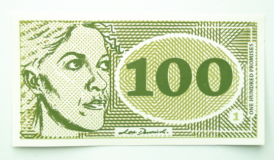
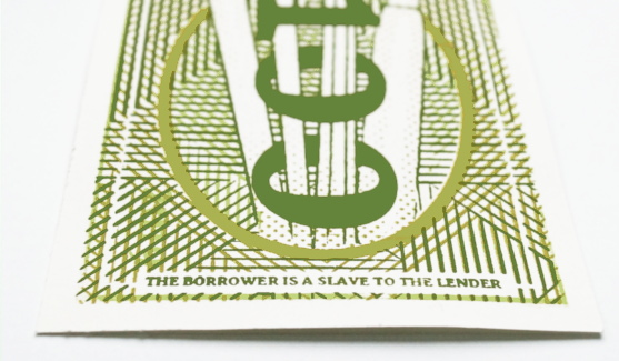
100, rear detail – “The borrower is a slave to the lender.”
The back side of the note features four tools of the artist’s trade – the pen, brush, pencil and gouge, referencing the variety of media in which I work. I’ve taken on this motif as a kind of identifying crest, repeating it in my pewter 250 coin… and it’ll be a repeating feature in other coinage and notes.
The back of the note features a quote from Proverbs 22:7, saying, “the borrower is a slave to the lender.”
The symbolism of 100
The denomination was always going to be important. As a central part of a larger body of work, this piece had to carry the anchoring number, and it had to relate closely to its value as an artwork – so in that sense, it chose its own denomination of one hundred.
One hundred what? This is the first of my money artworks to explicitly carry the name of my currency as “Promise”, although that is inferred as the title of my screen printed cheques.
Why promises? Well, the value of all currencies are in what they promise to give you in exchange. The money itself isn’t really any good to you; it’s what you can exchange it for when you need to exchange it. It’s the promise of transforming itself into something else, whether that’s a loaf of bread or a tank full of petrol.
If you have the nerve to put your face on something and assign it monetary value, then you’re making a lot of promises.
How it was made…
The images were mostly hand-drawn and repositioned by extremely old-fashioned cutting and pasting, with a lot of photocopying to resize. It’s left me with a sketchbook full of copied pieces and variations, which is interesting in itself.
Of course, I realised after doing most of this that I should have designed it all on a computer instead for pinpoint accuracy, but the fact is that the handcrafted element does reflect my personality and working style. Will I adapt to take on faster methods? Absolutely! But this piece has had a lot of hand-work put into it, which makes it special to me.
The piece is a 3-colour, double sided screen print, which is a technical challenge – 6 opportunities for something to go wrong! Actually, there were seven pulls in all on each note, as the note’s number is added afterwards with a separate screen.
Each colour had its own unique screen which was printed light to dark. Several different papers were tested for their colour and handle, but I selected a light cartridge for its bright white colour and flexible handle – the note is meant to be held as well as looked at!
Overall it was everything I enjoy in my work – a technical challenge and a deep concept to dive into.