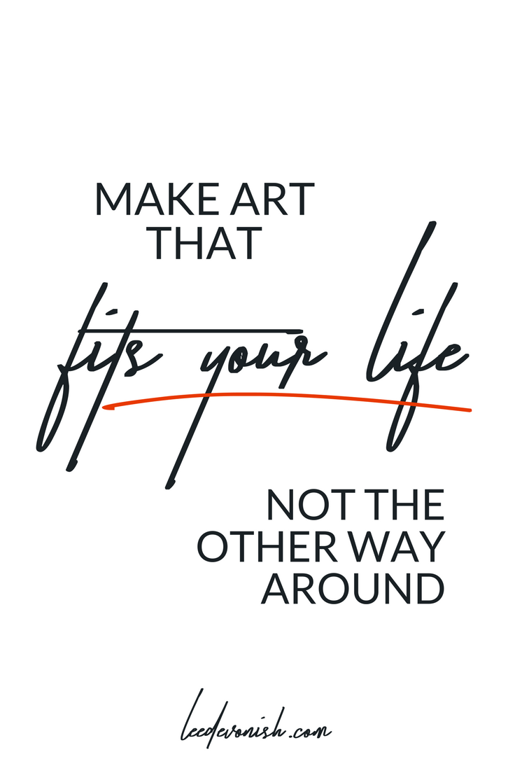
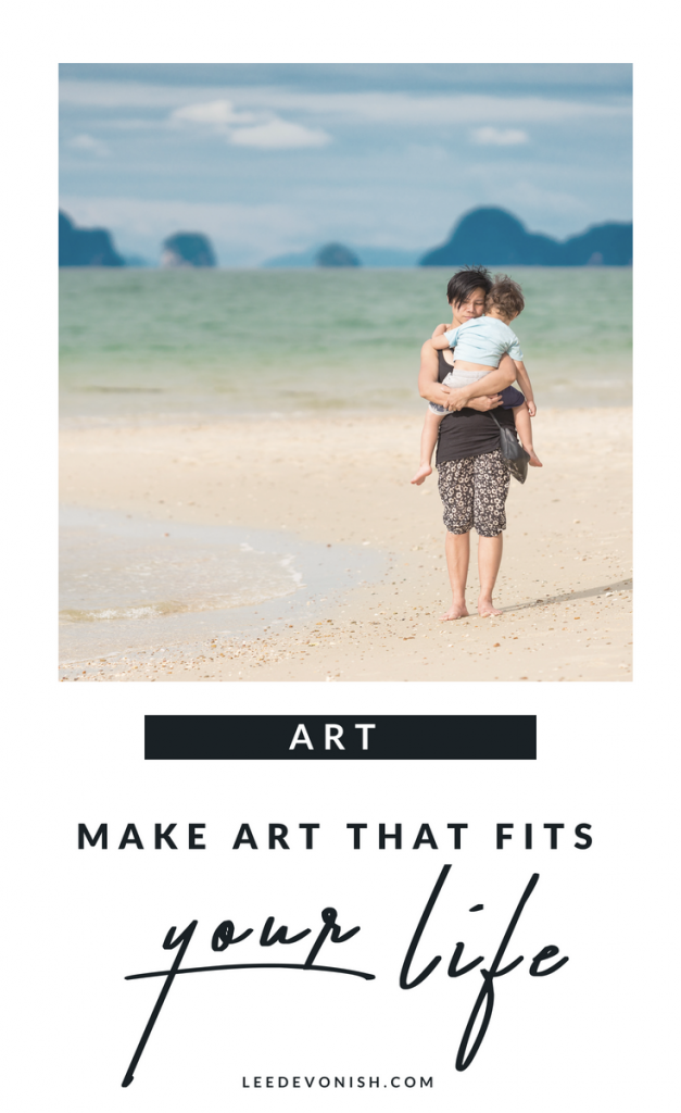
What do I mean by making art that fits your life?
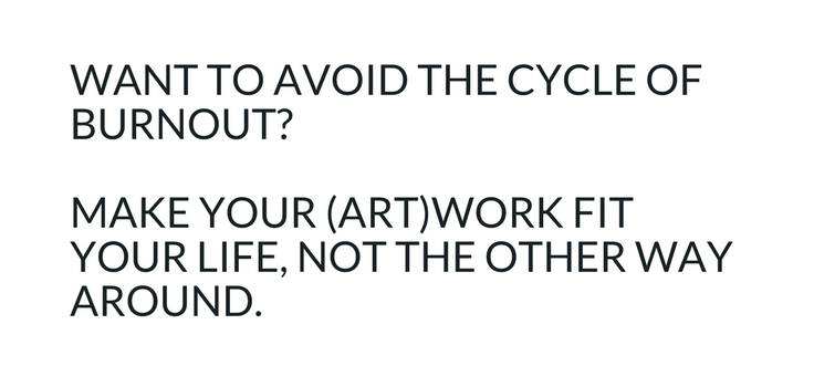
A while ago, I wrote about the cycle of burnout that I’ve experienced by trying to achieve too much in too short a space of time. I took a quote from that post and put it on Instagram:
Another artist commented, “Ok. What does that look like?”
Fair question! Here’s what it looks like for me:
My circumstances limit me, but that’s ok – they also make me
When I dove back into fine art by resuming my degree, I was overwhelmed with how much “catching up” I had to do in order to get back to where I would have been a decade before. I didn’t have many gallery shows to put on my art cv, and I couldn’t apply for residencies as I was a single parent. Every job, opportunity or event I applied for had to fit in around the school run, vacation times and babysitters.
I was anxious to get things right, so I did try to hit the ground running after I graduated – I took my son to school and drove for hours to a stately home where there was a callout for a site-specific commission. After the tour and presentation, I raced back to the school to pick my son up. It was an exhausting day… and ultimately I didn’t get the commission. Of course, I was disappointed, but in hindsight it was clear that the opportunity was just that bit too far away for me to realistically manage.
For a long time I seemed to come across exhibition callouts, commissions, jobs and residencies that I couldn’t do. I kept on seeing the residencies, unpaid internships, weekend work, socially engaged practice commissions, day-long networking meetups and other opps that I just wasn’t cut out for. Most of it came down to the fact that I was a single parent, and that was not going to change.
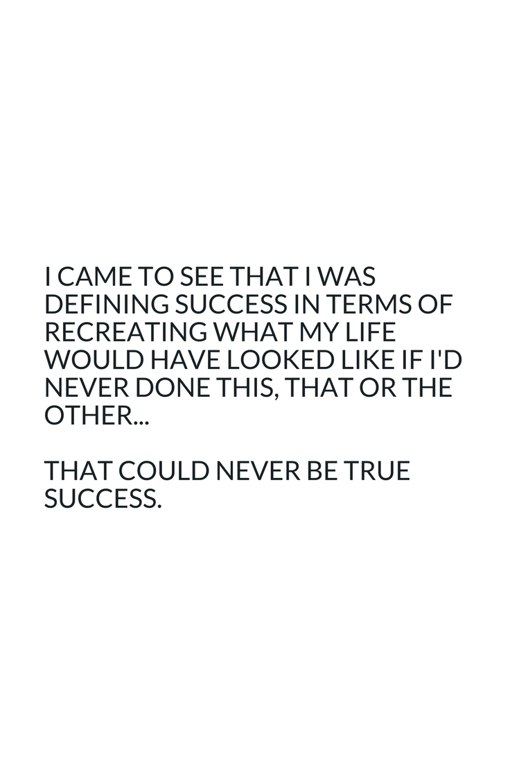
Eventually I came to see that I was defining success in terms of recreating what my career would have looked like if I’d never dropped out of art school, moved across the Atlantic and had a child. But if none of that had ever happened, I wouldn’t be me today. I would never trade having my child for anything, so why should I compare my life with him to a life without?
I believe that many women face the same situation, as women still bear the primary responsibility for childcare in most households and experience the physical interruption of their careers when they have children. Of course, there are some men who find themselves in a similar situation as well. What I’m suggesting is not to deny oneself the right to aspire to ambitious projects or work, but to accept the fact that your limitations are not necessarily negative, just because it doesn’t fit the picture that you may expect.
Circumstances that limit us can be seen as parameters in which to function and perhaps flourish. Of course, if something is within your power to change, and you want to change it, then do it! Shortly after my experience with the failed commission bid, I moved to London – a pretty big move for my family – to work and study. It meant that I seriously stretched the boundaries of my limitations and ultimately, I gained a lot from it.
Looking at what I could do instead of what I could not
Unpaid internships – I had a child to care for, so no thanks. Weekend work – no childcare and no desire to miss out on all that time with my son. Networking – only during certain hours. Socially engaged art and workshops – I had no experience and frankly, no real interest in them.
I felt as though I was facing a brick wall of “no”. Fast forward several years and I have very different circumstances, and with them a different set of limitations… but I also have a lot more contentment than I used to, and that’s integrated with focusing on my opportunities. Seizing the opportunities that were available to me meant I gave a lot of energy to work that I could do from home, and it led to the creation of my tiny online empire!
Now, I sell my art on Etsy, run several blogs and work part-time in art education. I’ve also started to develop a course to help artists who feel a bit derailed by life’s limitations, especially financial limitations. You can find out more about that over on artandmoney.co.uk.
I’m a lot happier and a lot more productive because of creating the right environment in which to make my work – making the work that fits my life!