A Manifesto For Contemporary Realism

A Manifesto For Contemporary Realism:

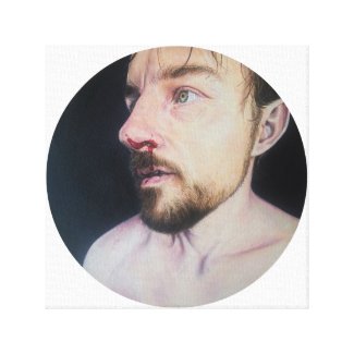
Recording for history, creating diagrams of the day to day. In recording animate objects, there inevitably comes the knowledge that they will eventually become inanimate… I enjoy the idea of representing life to celebrate life.

This is my visual recording.

I am highly aware of working within a European tradition, but I believe tradition is pointless if it exists for its own sake. It amounts to no more than the misplaced reverence of the dead. However, traditional craft is an invaluable tool for the visual storyteller, whether satirist or celebrant.

The history of Western figuration represents a visual lingua franca, invaluable for manipulation in storytelling. Working within and right up to the bounds of history and tradition can serve to point to its omissions and failures. One merit of figuration is its accessibility. Humans naturally relate to representations of themselves and their created environment, and thus they can be a vehicle for conveying empathy and comparison because of self-recognition.

Portraiture and the figure

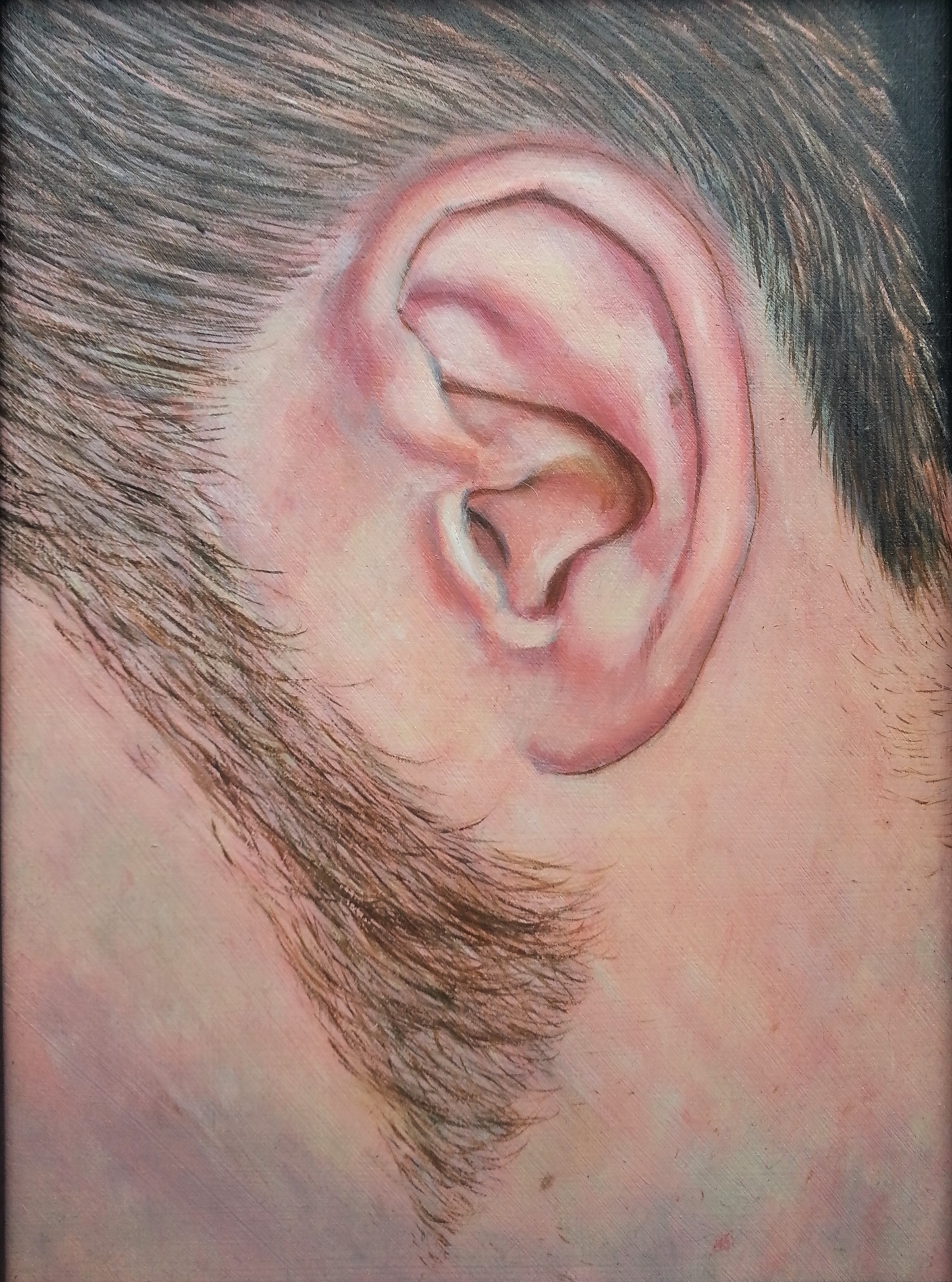
Drawing and painting are central to my practice, but my love of creating and learning leads me to embrace many different media. What remains consistent is my interest in portraiture and the human figure. It may be akin to the Renaissance ideal of placing man at the centre of the universe; in any case, it serves to communicate shared experience.

My focus on the male figure may invert centuries of art history, but is a purely instinctive response in choice of subject. Some of the themes I naturally explore are relationships, love and day to day life, situations (or the pursuit of such situations) which are common to us all, and which have untold power over our lives.

How I define contemporary realism in relation to my art practice - and how that relates to 'traditional' figuration.

Conceptualism and craft

Personal involvement, labour and precision are very important to me. I try to incorporate my experience in varied fine and applied art media to my work, blurring the lines between them to point to their equality in the hands of the artist, and to my personal vision through the control I exert over them.

I could never be a purely conceptual artist; Victorian concepts of value and virtue having been ingrained in me by my upbringing preclude such a line, in my case.

Personally, I have an irresistible need to create.

For me, the value of art is bound in its craft. Value, being subjective, is at once a risible concept, yet of the highest importance to humankind. The exploration of worth and perceived value is an ongoing part of my wider artistic practice.

My version of realism

I am a realist. This is accurate, not only in referring to my traditionally naturalistic depiction of figures and objects, but in that I depict people, situations and conversations that have existed and that may be recognizable to many.

As the reality of life in the western world now means the pervasion of digital technology, its depiction within my artwork is unavoidable, perhaps necessary.

The co-existence of the highly polished, intangible, artificial world with the frail, fleshy, inescapable humanity is something that I find extremely interesting.

The souvenirs of choice for lovers may no longer be painted portraits or even printed photographs but digital images; but as long as we are human, their conversion into tangible objects, with physical presences, will be irresistible.


How To Customise Colorlib’s Illdy WordPress Theme

This post contains affiliate links, marked by an *

Customise Illdy without losing your mind.

Need a domain? Get a .design, .ink or .wiki domain for $5!*

I was a total WordPress novice when I decided to make the leap and switch this site over from Weebly to WordPress. Honestly, I had no idea what I was doing, and fumbled around until I found a theme I loved – Illdy.

It was free, which was amazing, as it gave me the best-looking website I’d ever owned; but of course there were some things that I needed to tweak as I grew more confident with code.

Here are some of the css code snippets I’ve used to customise Illdy for my website.

Adapting to Illdy updates

I’ve dreaded each update to the Illdy theme, because there’s always some major change to cope with. This means there’s new codes and changes to add to this post, so bear with me as I add them soon. And yes, I actually created a child theme for Illdy to prevent the changes, but somehow I couldn’t get my child theme to respond fully to all the changes I’d made… so I had to stick to the developer’s theme.

But then, the last update made my site look horrendous, and I went running back to my child theme. It’s meant that some of my links won’t change to the right colour, but I’m trying to work on more important things at the moment… in the grand scheme of things, a few yellow hover links don’t make a difference.

Hey, I’m still a novice; I just do my  best.

The CSS codes to change Illdy, and what they do.

Change colour of links

.markup-format a {
    color: red;
}

Remove link underline

.markup-format a {
 text-decoration: none;
}

Remove yellow dots from jumbotron

#header .bottom-header span.span-dot {
display: none;
}

Like this post? Check out the resources I use for creating and managing my websites!

Change contact form background colour

#contact-us {
background-color: #ffffff 
!important;
}

Change contact form name, email and subject background and border colours

 
#contact-us .section-content .wpcf7-form p .wpcf7-text {
background-color: #ffffff;border: 1px solid #baa9a9;
}

Change contact form message box background and border colours

#contact-us .section-content .wpcf7-form textarea {
background: #ffffff !important;border: 1px solid #baa9a9;
}

Change colour of the first jumbotron button

#header .bottom-header .header-button-one{    
line-height: 63px;    background: #e83904;    border: none;
}

Change hover colour of the first jumbotron button

#header .bottom-header .header-button-one:hover{    
background: #1a2226
}

Change colour of the second jumbotron button

#header .bottom-header .header-button-two {    
background: #1a2226;
}

Change hover colour of the second jumbotron button

#header .bottom-header .header-button-two:hover {    
background: #e83904;
}

Change colour of widget lines

.widget .widget-title:before {
background-color: #e83904;
}

Change hover colour of social share widget

.widget ul li:before {
color: #e83904;
}

Change colour of “read more” link under blog preview

#latest-news .section-content .post .post-button {
color: #e83904;
}

Change colour of “read blog” button

#latest-news .latest-news-button {    
background: #e83904;
}

Change colour of “read more” button on blog page

#blog .blog-post .blog-post-button { background-color: #e83904 !important; }

Change colour of author icon on blog post

#blog .blog-post .blog-post-meta .post-meta-author .fa {    
color: #e83904;
}

Change colour of author text on blog post

#blog .blog-post .blog-post-meta .post-meta-author {    
color: #888;
}

Change colour of date published icon on blog post

#blog .blog-post .blog-post-meta .post-meta-time .fa, #blog .blog-post .blog-post-meta .post-meta-categories .fa {    
color: #e83904;
}

Change colour of comments icon on blog post

#blog .blog-post .blog-post-meta .post-meta-comments .fa {    
color: #e83904;
}

Remove/change padding on home page

body.home.page section.content-area {    
padding-top: 0;
}
body.home.page section.content-area {    
padding-bottom: 0;
}
body.page .post-inner-content {    
padding-bottom: 0;
}
body.page .post-inner-content {    
padding-top: 0;
}

Remove/change padding on about section

#about, #static-page-content {     
padding: 10px 0 0px 0;
}

Remove/change padding on latest news/blog section

#latest-news, #static-page-content { 
padding: 0px 0 0px 0; 
}

Remove/change padding on contact us section

#contact-us, #static-page-content { 
padding: 0px 0 0px 1; 
}

Remove title from blog titles and page titles

#header .bottom-header h1 {
display:none;
}

Change display size for mobile devices

@media only screen and (max-width: 768px) {
#header {
background-attachment: initial !important;
}
}
@media only screen and (max-width: 480px){
#header .bottom-header h2 { 
font-size: 30px; line-height: 1.2; 
}
.top-header img { 
width: 250px; 
}
#header .bottom-header { 
padding-top: 50px; padding-bottom: 50px; 
}
}

Hide date published

.blog-post .blog-post-meta .post-meta-time { 
display: none;
}

Hide author

.blog-post .blog-post-meta .post-meta-author { 
display: none;
}

Hide comments

.blog-post .blog-post-meta .post-meta-comments { 
display: none;
}

Change Mailchimp subscribe button text colour

input#mc-embedded-subscribe.button { 
color: #ffffff 
}

Change Mailchimp subscribe button colour

input#mc-embedded-subscribe.button { 
background: #e83904;
}

Change contact form submit button text colour

input.wpcf7-form-control.wpcf7-submit  { 
color: #ffffff 
}

Change contact form submit button colour

input.wpcf7-form-control.wpcf7-submit { 
background: #e83904;
}

Change widget text colour

.widget a {
    color: #e83904;
}

Remove page titles

#blog .blog-post .blog-post-title { display: none;
}

The end.

So there you have it – all the codes I’ve used to change aspects of this WordPress theme. I hope it’s been of some use to you… and remember, I’m an artist, not a web developer. This is just my hobby 🙂

Subscribe to my newsletter below for more tips on DIY marketing and web management for creatives!

 Reading suggestions


The Best Spam Comments On My Blogs This Week – #3

The best spam comments left on my blogs this week.

I’ve actually made it to three installments, because the spam just keeps coming. Sometimes it’s hard to believe the stuff these people make up, but I’m seeing a variety of approaches the closer I look into it.

The spam void. Beware of looking too closely… you might fall in and never return. Anyway, here they are.

You want to what?

“Awesome issues here. I am very satisfied to
look your article. Thanks so much and I am having a look forward to touch you.
Will you please drop me a mail?”


Souper duper lacework.

“It’s souped up to understand the truths about lacework business.”

It might just be the combination of Google translate and a ripped off bit of text, but I appreciate the thought of someone getting truly revved about the secrets of tatting.

What? Seriously? An actual comment?

“This is truly useful, thanks.”

Hmmm. Deceptive.


These guys are getting deep now…

“Who dominates the truth, also dominates the internet market.”

Written in an almost scriptural tone.


Go on then…

As good as last week? Definitely creepier. Seen any good ones this week?


Waterloo

Waterloo

In the evening I walked through the subway towards the station.


I saw the writing on the wall, and realised I had walked into a poem. One that was meant to be commenced at my destination. For those going towards the city.

Pointless to read, but I glanced nonetheless. I would not have stopped, but that one line not hit me like a cold slap across the cheek. It may have been written for all travellers, but today it was only for me.


I read it again.


I knew, I remembered, because of that very day. A day of watching lovers in Westminster, lovers in Jubilee Gardens, lovers in Waterloo.

I remembered without jealousy when we were them, or they were us. I was as happy for them as I was happy for us. I remembered that day when we rolled on the grass in that public private garden, putting on a show of the most exquisite happiness for all the people having their lunches, reading their books and waiting for their buses.

We strolled from park to place to point, never needing to be anywhere but the place we were. Up there on the cool grass, I laughed so hard, kicking my legs in the air, holding his face over mine, pulling his arm around me, pulling my dress down around my knees for the sake of the strangers. But now, under pavements, I am sucked through a concrete straw, into the mouth of Waterloo station.


The words on the rounded wall pointed to me alone and my dream of a garden, faded and foxed like a watercolour left in the sun.


I remembered another summer in another garden in London, sunlight on my face and hands in my hair. Then flashes of trains, airplane windows and cars, always moving and waving goodbye. A Venn diagram of our worlds merging in the thinnest secondary-coloured sliver. But then how I suddenly thrashed and reveled in wonderful grief, doubled over clutching at my stomach, gasping, barking, rasping.

I remembered how I grieved then for the grief itself, quietly and exquisitely, drawing out its every breath and measuring its feebling pulse. Then how I suddenly wished it dead. I folded it neatly and put it into a box of favourite mistakes, there to gather dust and eventually, hopefully, innocence.


Cold uneasiness came over me, faced with the fading stain of the kiss that was once so eager, then became so weak. Not just the draft through the tunnel.


It was the guilt. Of not wanting to live in the dark any more.


Guilt. The guilt of letting it go and it letting go of me.


Guilt. Of cruelly prising apart the grip of my right hand with my left.


Guilt. Of wanting to see the surface again.


But how long could I stand motionless in front of these words? There could no longer be any place left for it, not by my invitation. Neither here in this close tunnel nor above ground. Up there, my green garden belongs to lovers; down here, it cannot exist. The expectation and the memory fought. Green and grey, they collided and kicked at each other until I tore them apart. Crumpled and flung into the corner like read letters. So it had to be. I knew it wasn’t a promise; it was only a plan.


I had a train to catch.


Originally published in 2011, this was inspired by my first encounter with Sue Hubbard’s poem “Eurydice” on the walls of the Waterloo underpass.


0