Tagged Drawing

Don’t Buy This: The Irony Of Selling Anti-Consumerist Art 

Don’t buy this: the irony of selling anti-consumerist art

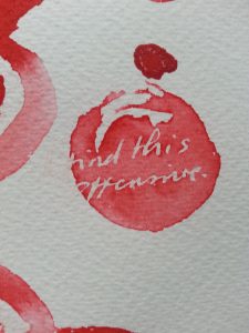
Don't Buy This Laptop Skin

I’ve always considered myself to be in the anti-consumerism camp, but gradually, I started to question myself.  As I started to lean towards selling my work (or at least considering making some new art for sale, something I had not wanted to do for a long time), I wondered if I could still be anti-consumerist. How true can that be of anyone who offers anything for sale?Consumerism is about more than simply buying, though; it’s the buying into the incessant bombardment of products and services that we’re told we need to become, and then remain, happy and acceptable to others. I knew this, but my aversion to selling came from something else.

For years I’d been the charity shop regular, happy in my penny-pinching, eco-smug ways. I also had a period of intensive making for a craft business I ran, which eventually led to my shrieking and running away from all aspects of routine production and making anything for sale. I basically overdid it and ended up hating it, so any way that I could make a living from art that didn’t involve selling art sounded absolutely perfect.

Combining conceptual and commercial art

In time I came back around to the idea of making work for sale. I had to play around with the idea of purposefully making something for sale that expressed my dislike for both selling and buying.

It started off by developing a screen printed image from my handwritten instruction: “don’t buy this.”

The great thing about it was that whilst it was displayed in a gallery setting, it would make perfect sense. After the point of sale, would it work as a message? The message would have been ignored, but the art would exist in the process of a buyer seeing and acknowledging my message, and either accepting or ignoring it… the process of selling would be part of the artwork.

Maybe it would work as a warning not to buy into the message at all – the message of conceptual art itself.

By shifting the artwork from a screen print – the pop art cousin in the fine art family – to print-on-demand goods, the whole thing turned into a conceptual art exercise.

The simple message

Thanks to print-on-demand I have little control over the actual product, but the fact that my message is applied to a product links me to it, or embeds me in it. Perhaps that’s the purest form of a conceptual work of art – an idea that can embed the artist within anything.

Each one of us would take something different from a product like this, which is essentially a message. Too simple? Too convoluted? Recently, I’ve come to appreciate the quality of simplicity. Artists can tend to overstate the obvious out of fear of appearing to lack depth, but this often ends in a deep pool of artspeak.

Mass-marketed pop as random deep thinking

Perhaps the most exciting thing about using a print-on-demand service to distribute my work is seeing what it’s applied to in actuality.

​I love that someone chose this for a laptop skin. I love the curious crossover of selling non-consumerist consumables.

Letting part of the artwork-making fall into the hand of the buyer is actually a lot of fun – I hope that’s true on the other side as well.

How to buy (or not buy)

Original screen printed work is available in my shop.


Is It Printmaking or Drawing? Art Between Boundaries

Is it printmaking or drawing?

And does it matter? I’ve made a number of text-based paintings, which I like to describe as the result of thinking about trying not to think too hard. Not thinking too hard is nearly impossible for me, so as an exercise these works were fantastic!


A loose process, tightly managed

There’s an element of relaxation in the process of abandoning total control of the paint and letting it do its thing, but even this is not really complete; the process is managed throughout. I’m not one for completely gestural work and to go in for that entirely would feel false to myself.
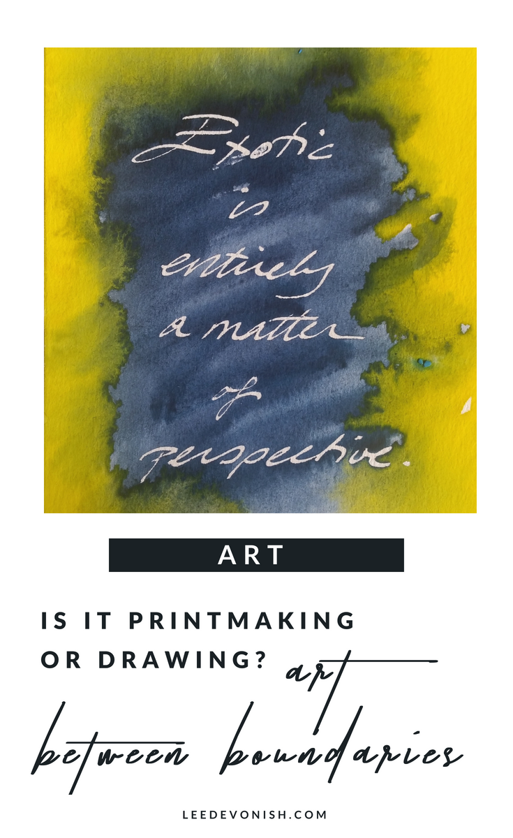
Exotic. Handwriting print by Lee Devonish, 2014
Exotic. Watercolour on paper, 2014

There are a limited number of prints, each one unique in its own way.


The process of drawing becoming printing

I think of these pictures as prints, although they are simultaneously drawings and paintings. Although they do not fit the mould of traditional printmaking, the work is approached as an edition, produced at the same time, and created by repetition of a specific process.

My handwriting is my specific graphic fingerprint, which is the same, yet different each time. This is repeated in the paint, the colours of which are the same each time, yet different, as the process of interaction varies across the surface.


Text in art and its associations

Of course, these are redolent of associations with Jenny Holzer, John Baldessari and Tracy Emin; for me, I like to think that they are the graphic link between the conceptually privileged thought/word and the thing/image.


Exotic?

The concept used in this example is something that I’ve batted around for years, and I know to be something that occurs to all people like me – people who have moved around the world and viewed it from new angles. The idea relies on the received notion of perspective, which should make it immaterial… but the word is a much heavier one than it should be.

It links to the idea of the words ‘immigrant’ and ‘expat’, and how we choose to assign these to people from different backgrounds.


How to buy:


Original prints are also available in my Etsy store.


‘Exotic’ is also available as part of my dissemination range from Zippi, where it is available as a print on a selection of items.
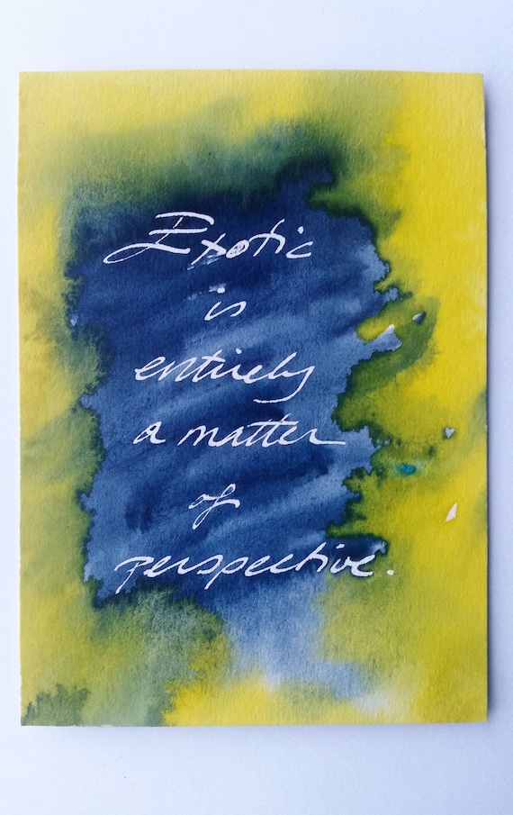
Print drawings are the overlap between drawing, handwriting, painting and printmaking. The printmaking or drawing process involves repetition and creates art between boundaries.


Other People’s Hair

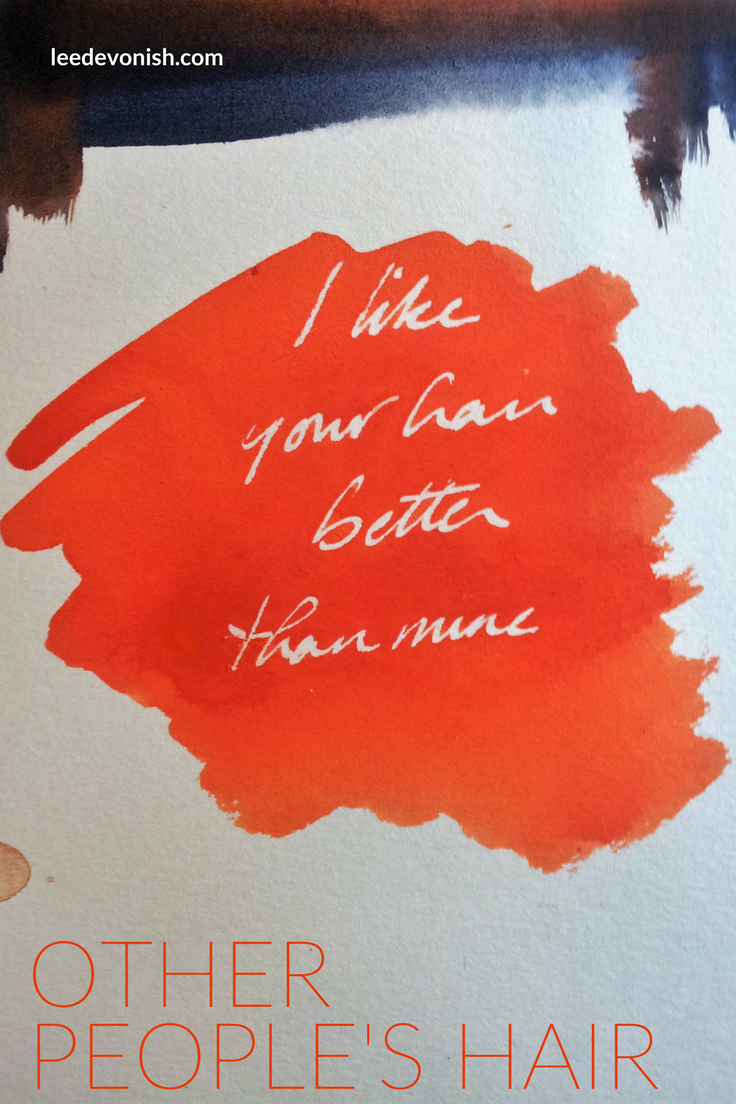
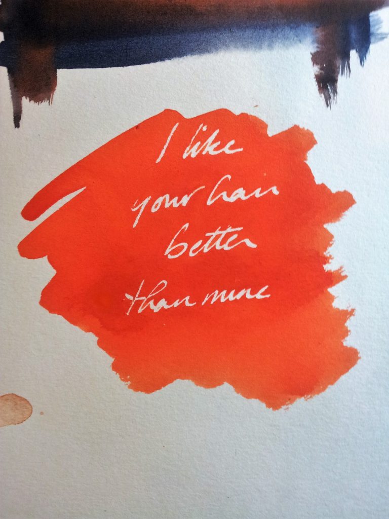
“I like other people’s hair better than mine.”

Isn’t it always the way?

What’s the weird compulsion to straighten our hair when it’s curly, or curl it when it’s straight?

A lot of the time we’re fighting against our genetic nature: striving to differentiate ourselves from our immediate peers. We put on a style to describe who we are and what we are, or at least what we want to be.

Life gets much easier when we just accept what grows out of our heads (or what doesn’t), and make the most of that.

By the way, I don’t really like other people’s hair better than mine.

Maybe I used to once… but I’ve grown out of it, and my hair’s grown out too.


How does your hair shape your identity and community? Read “Roots And Culture” for more.


Perspective

Perspective

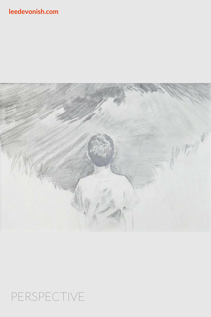
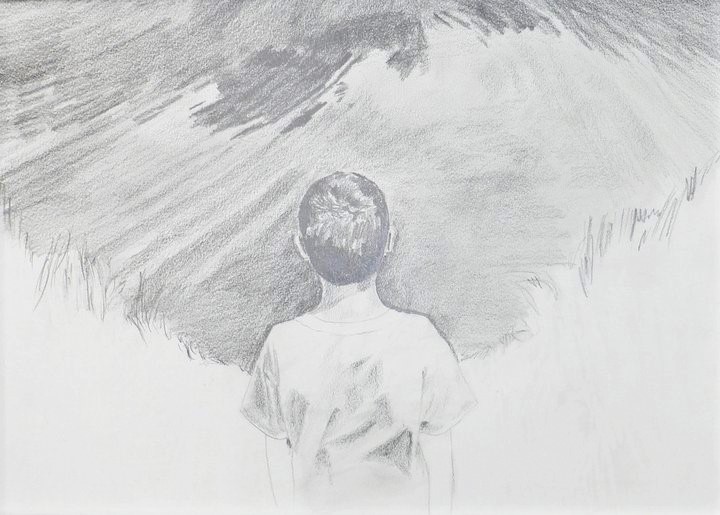
Graphite on paper, 2011

I’ve always been attached to my artworks – I don’t churn them out, and I feel a strong sense of reluctance when it comes to selling them. There are a few that I’ll never sell though, and Perspective is one of them.

Drawing children

Children grow and change so quickly, and capturing them on a smartphone screen is understandably something that parents today can’t resist. (If you don’t have a baby bore on one of your social media feeds, then it’ll be you.)

None of our images are fixed, but their images are more precious because of being in such rapid transition. Speaking of rapid, it’s incredibly hard to draw children (or at least a child like mine) from life, as they’re constantly in motion and cannot sit still if they’re told to.

Still, drawing your child is a strange and enlightening experience. You’re able to employ and enjoy your love for them in an entirely new way.

The Arboretum

The image I used for this artwork came from a photograph I took of my son when we were in Boston, MA in 2010. It was the first time I’d been able to travel to the USA in 10 years due to visa restrictions on Barbadian citizens, and the first time I’d been able to take my son to visit his grandmother at her house.

On this day we took the bus to Arnold Arboretum alone. It was a good day for it – sunny and warm. When I think about it now, there aren’t many details, which is a bit sad; me, looking at horticultural labels and picking out postcards for souvenirs, and my little boy constantly racing ahead of me.

We reached a pond and stopped, and I snapped a picture of him looking out over the water. The photograph itself was nice enough, but I don’t know exactly what it was that made it stand out so much in my mind.


Perspective by Lee Devonish. Click on the picture to read more about the story behind this drawing.

Water

There’s the combination of dread whenever water and children come together, along with the way the water and the rippling patterns on its surface captured us both. It was a beautiful scene, but the idea of this young life spread out before us like the surface of the water (with so much unseen going on underneath) must have stuck with me.

I remembered us experiencing this and wondered about his perspective on the world.

The drawing itself is simple and sparse, with a lot left out, but that leaves the focus on the little boy and the setting before him, which may or may not even be water if you look at it for long enough.

This is one that I won’t ever sell. This memory feels as though it was yesterday, but looking at my child today, the boy in the drawing seems so small… at least I’ve caught that day for myself.


This drawing is available as a print from my Zazzle store.


Concept/Word/Image

Concept/Word/Image:

A few years ago, I wrote an essay entitled “The Thought That Counts”, on hierarchical dualisms within academic and non-academic modes of thought.

In it, I tried to address all manner of subjects including conceptualism, craft, feminism and graphic novels, linking these through similarities within oppositional pairings.

The sprawling project did earn me my Master’s degree but also helped me to address my own practice, in the way in which I became interested in binding thought, language and writing with the image.

Mixing it all together

Personally, I’ve come to re-think my previous work on the gendered gaze, or the male as recipient of the gendered gaze, and try to combine visual and textual elements to be read as equal signifiers… or ignored, at the viewer’s pleasure.

The visual representation of thought is a concrete device of the graphic novel that I want to transport to the realm of the single-frame ‘fine’ art piece.


Sketchbook doodle by Lee Devonish, 2015

Why watercolour?

I’ve chosen watercolour for this kind of work precisely for its unfashionable status and attachment to now-repugnant understandings of art and middle-class respectability. (Think twee cottages and greetings cards.) There’s also the matter of its legibility – it’s familiar and understandable, and downright gorgeous at times.

What’s next?

I don’t know.

As my work continues I hope for it to provoke some internal discussion over the remaining hierarchical structures surrounding concept, word and image – will it actually succeed? .


0