Posted in Art

Making the 100 Promises banknote

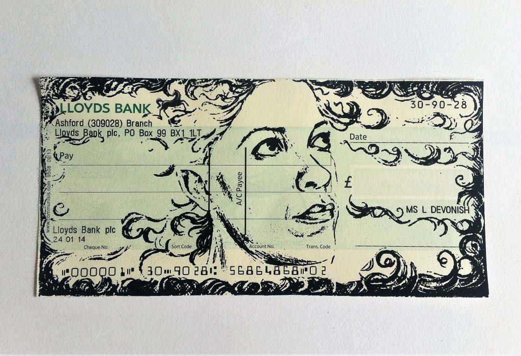
When I first started thinking about making an artist’s currency, way back in 2014, I thought about it both taking the form of coins and notes. Along the way, it was clear that most artists’ currencies take the form of notes, and it’s easy to understand why.

Notes are far, far simpler to make than a metal coin. The first banknotes were just written promises to pay a sum of money, after all.

Notes and coins are both immediately part of the language of money, but notes carry the connotation of high value. The exception is in the US, where their single dollar is still a paper note… but the US’s cultural capital is so strong that it’s made sure that the visual shorthand for money takes the form of a greenish paper bill.

So although I wanted to create both coins and notes, a paper bill had to form part of my currency, no question.

Why screen print the 100 banknote?

Printmaking is the technique that one would obviously turn to when aiming to reproduce currency – because there would have to be several of the same notes in “circulation” – and etching is the printmaking technique associated with banknotes and with money in general.

Just because I wanted to create a banknote didn’t mean I wanted to copy a banknote… I also wanted to evade expectations somewhat. Give a bit here to the accepted concept of money, take a bit away there.

Screen printing is a very interesting technique, as it can be dead simple or ultra-complicated. Multi-colour screen printing is difficult to perfect without a professional system for registration, so getting perfectly identical prints was always going to be near impossible. I liked the idea of the human touch coming through the attempt to mechanise the process, with all of the “flaws” – misregistrations, bleeds and fading – form an essential part of making each note an individual work of art.

Also, there’s the fact that I feel as though the medium of screen printing is part of my personal artistic practice. There are lots of things I like to do and to try, but only a few I think of as “what I do”: painting, screen printing, ceramics and sculpture.

Elements of the visual language of money: colour, shape and symbolism

I stuck with the immediacy of green. For the first banknote I would make, I had to keep it simple; this is an artwork made to illustrate a concept, and it had to speak out the concept clearly.

Although I initially planned for the piece to take on an overall more pea-green, but not quite Kermit, tone, things got derailed one-third of the way through the printing. I decided to incorporate a more olive-toned palette

The same thing went for the shape and general format of the portrait. It may seem as though I was immediately working with lots of design constraints… but in the beginning stages I planned the note to be square, just to mess with our widely-held ideas of what money should look like. That just didn’t feel right though, so rectangular it was.

What I did particularly want to play with was the abstract patterning on the notes. I just love geometrical arrangements and started to experiment with the idea of optical mixing by overlaying printed acetate sheets in a kind of “lite” op-art.

Layering a couple of half-tone screens on top of each other gives each note a unique patterned effect, as each one can look very different from the other if the alignment is changed only slightly.

Bottom of rear side of banknote saying: "the borrower is a slave to the lender".
100, rear detail – “The borrower is a slave to the lender.”


The back side of the note features four tools of the artist’s trade – the pen, brush, pencil and gouge, referencing the variety of media in which I work. I’ve taken on this motif as a kind of identifying crest, repeating it in my pewter 250 coin… and it’ll be a repeating feature in other coinage and notes.

The back of the note features a quote from Proverbs 22:7, saying, “the borrower is a slave to the lender.”

The symbolism of 100

The denomination was always going to be important. As a central part of a larger body of work, this piece had to carry the anchoring number, and it had to relate closely to its value as an artwork – so in that sense, it chose its own denomination of one hundred.

One hundred what? This is the first of my money artworks to explicitly carry the name of my currency as “Promise”, although that is inferred as the title of my screen printed cheques.

Why promises? Well, the value of all currencies are in what they promise to give you in exchange. The money itself isn’t really any good to you; it’s what you can exchange it for when you need to exchange it. It’s the promise of transforming itself into something else, whether that’s a loaf of bread or a tank full of petrol.

If you have the nerve to put your face on something and assign it monetary value, then you’re making a lot of promises.

How it was made…

The images were mostly hand-drawn and repositioned by extremely old-fashioned cutting and pasting, with a lot of photocopying to resize. It’s left me with a sketchbook full of copied pieces and variations, which is interesting in itself.

Of course, I realised after doing most of this that I should have designed it all on a computer instead for pinpoint accuracy, but the fact is that the handcrafted element does reflect my personality and working style. Will I adapt to take on faster methods? Absolutely! But this piece has had a lot of hand-work put into it, which makes it special to me.

The piece is a 3-colour, double sided screen print, which is a technical challenge – 6 opportunities for something to go wrong! Actually, there were seven pulls in all on each note, as the note’s number is added afterwards with a separate screen.

Each colour had its own unique screen which was printed light to dark. Several different papers were tested for their colour and handle, but I selected a light cartridge for its bright white colour and flexible handle – the note is meant to be held as well as looked at!

Overall it was everything I enjoy in my work – a technical challenge and a deep concept to dive into.

See more pictures and buy online.


What Should I Paint?

What should I paint?

The question of subject is one that constantly reoccurs to me:


What should I paint?

Why do I want to create a work about this?

Should I?

Is it worthwhile?

What will everyone else think?


Having a sense of self consciousness is vital to thinking critically about my own work, but I may just be the kind of person who thinks themselves out of action.


Analysis paralysis again…


Usually what I consider the most successful work comes about when I stop obsessing about the reasons I feel interested in something and simply explore the idea.


Give yourself permission to experiment… and fail.

The major editing has to take place during the creation, or even afterwards, or else I have the tendency to talk myself out of every idea. This excess of thought is probably what kept me away from painting for many years. Only since I have given myself permission to fail have I been able to see results.

Having a visual record of a thought gives me a chance to assess its strengths, weaknesses and future development… and these infantile records often come to have their own lives independent of whatever work they may have triggered.


You only figure out what you should be painting by trying a bit of everything.


Over the years, because of knocking around and trying different things, I’ve realised that I gravitate towards depicting the human figure, and that everything surrounding exists in its orbit. The landscape exists because it is viewed by the person. The objects have been arranged by, or carelessly left behind by someone, who may reappear at any moment. Although the places, rooms and objects hold their own value, it is the people populating the spaces I return to instinctively.

Just how to use this, now, is the thing I’m continually working at.


The world outside of the figure

Of course, not all of my work revolves around painting portraits; some of my recent text-based prints focused solely on handwriting and colour. It’s possibly a strange departure, but when I consider how much a part of me my writing is as well, the text pieces are a natural progression of my words flowing into the visual.


Why I paint portraits…

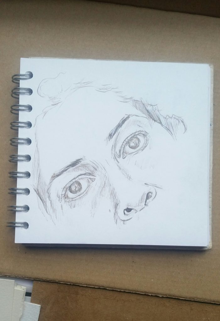
I love examining the nuances of faces, and the angles and relation of each part to the next. Portraiture has fascinated me since I was a child. The capacity to render another person’s likeness is a tremendous thing to discover as a young person, but the discovery that that capacity in itself is not enough, is even more so. That’s what spurs you on to make art.

When a painting is finished, and it represents many hours of contemplating another person’s face, attempting to conjure up some representation of their personality, you are left with the realisation that it is incredibly fragile.


What should I paint?

I should paint the idea I can’t do without. Here’s what it is for me:

A portrait – a depiction of a human being – can lose its meaning in a second, all because of what the subject does, or perhaps no longer does. The person changes continually whilst their image remains the same. It will never remain an accurate representation of that person; it can only be a representation of a subject at a single point, as seen through the mind of the artist.


It’s an exchange between two people who will never be the same two people again.Then, when either the artist changes her mind, or the subject changes himself (or is unwillingly/unknowingly changed), that representation can crumble into something quite meaningless.


That brief glimpse of meaning is what I want to paint.


What should you paint?

Ultimately it’s the meaning of the object or image, more than the object or image itself, that will give your work purpose and lead you on to the next step of your work. Start with something – anything – and mess around until you know what you don’t want to paint and what you want to.

The next time you think, “what should I paint?”, think about it as, “what do I want to say?”
 

If you've ever asked, "what should I paint?", you're not alone. For some artists, choosing subject matter is easy, and for others it isn't.


The Art Of Bodybuilding

Bodybuilder art / art about bodybuilding

You’ll often hear bodybuilding described by its practitioners and admirers as an art form.

Naturally, the medium frequently referenced is sculpture; it’s often invoked in the way that developing certain muscles is referred to as “sculpting”, and it leans on the languages of ancient nude statuary and the Neoclassical tradition.


Bodybuilders accept their place in the story of the idealised (predominantly male) body and they relish it. More than any artist in the contemporary era, the muscle-bound gym-goer carries the torch for the display of the body and the decisions as to what constitutes the ideal body. Now, more than ever, it’s acceptable to see muscles on display almost everywhere, and the depiction of the anatomical figure rests in the hands of advertisers and marketers instead of artists.


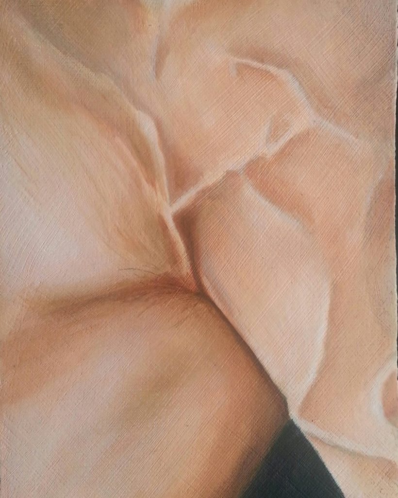
Muscle Study 1 by Lee Devonish | oil on board. Oil painting of a bodybuilder | muscles and veins
Muscle Study 1


Transforming the body

For some years I’ve been interested in the history of the male figure in Western art, but that’s not the main reason why I’ve started to make art about bodybuilding.

It’s the actual process of transformation that I find interesting, and the determination behind that process. We’re all being physically transformed, whether we like it or not: children grow, we get old, and most of us get a bit fatter with time. Passive transformations like these happen to us without being noticed, until we end up in a very different state after a few years have gone by.

Bodybuilding is a process of wilfully transforming from one state to another through a violent process; it’s the ripping of muscle fibres on a minute scale that creates the need for the muscles to repair and grow. There’s a fascinating force of will that goes into trying to control one’s body and manipulate it into something it would not naturally become.

My own interest in the culture started when I was very little, with my mother’s friend Tony “Broad Back” Parris, a well-known figure in Barbadian bodybuilding. I remember visiting him and having him lift me far above his head with one hand – he was definitely a figure to look up to!


Bodybuilding as a measure of masculinity

Bodybuilding is an overwhelmingly male pursuit, and I think it comes down to our inherent social expectations. That’s not to say that there aren’t lots of amazing and noteworthy female bodybuilders – it’s just that most women don’t size each other up on the basis of how big their biceps are.

Men still compete with other men in a race to be the biggest, while women are still conditioned to want to become smaller.


The art of bodybuilding

Nowhere does this seem more pointed than when looking at the art and illustration that accompanies bodybuilder culture – the visual language of bodybuilding. Of course, a lot of it has to do with the photography of competitors, as the purpose of posing is to display one’s body to one’s best advantage, and photography for posterity is essential.

But I’m talking more about the way in which built-up bodies are interpreted in visual culture, by fans of the sport and amateurs, as well as by designers and illustrators creating images for wider consumption.

In so many images, proportions are distorted to those incompatible with human life… it’s as if there is no such thing as “big enough”, no pleasure in keeping within the realms of reality. The most superhero-like beings amongst us are still contorted and stretched beyond all recognition. It’s as though those who are most keen to absorb this kind of visual spectacle get hooked and start to seek out more extreme bodies than the pec deck could ever provide.


Not convinced? Do a Google search for bodybuilder art, and skip through YouTube thumbnails of bodybuilding videos. The dedication to freakishly Photoshopped images is impressive.

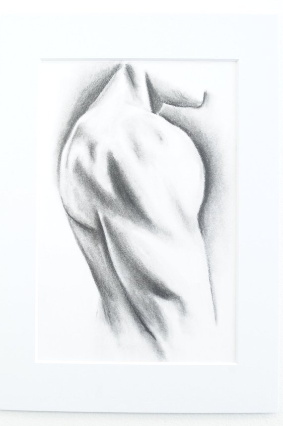
Deltoid - charcoal drawing, A4. Bodybuilder art | bodybuilder drawing


To me, it’s as if these bodies, that have been pushed to the edge of human capability and live in the realm of fantasy, are never seen as fantastical enough by their audience. They inspire thoughts of more are always pushed to being something more, something superhuman and, of course, superheroic.

Sure, it’s easy for a traditionally focused, representational artist to see something uncomfortable in the work of a predominantly comics-based segment of visual culture, but I see my art as celebrating the human endeavour and not just the end spectacle.


My approach to depicting the transformation of the built body

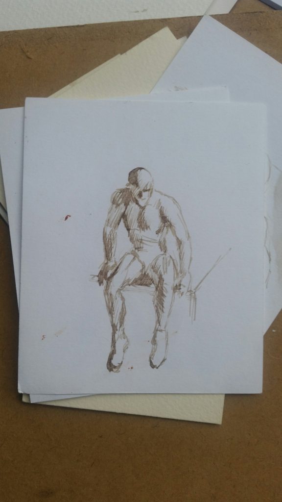
Instead of pushing the fantastical, spectacular aspect of the forcefully altered body, I take a more naturalistic approach, rendering bodies in a contemporary realist style. My goal isn’t to idealise any further than the model has been able to idealise himself; it’s to express admiration for the process of transformation – guided, willful, and of course, difficult self transformation.


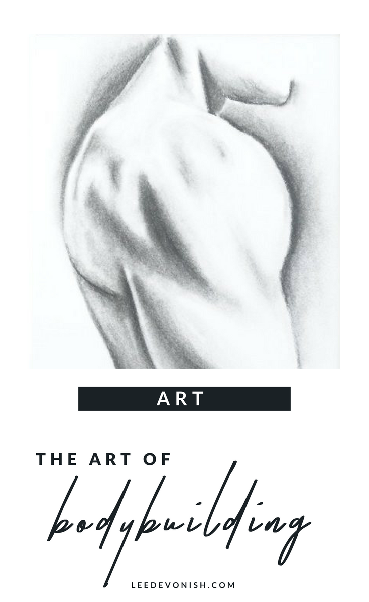
The art of bodybuilding | bodybuilder art and visual culture


Don’t Buy This: The Irony Of Selling Anti-Consumerist Art 

Don’t buy this: the irony of selling anti-consumerist art

Don't Buy This Laptop Skin

I’ve always considered myself to be in the anti-consumerism camp, but gradually, I started to question myself.  As I started to lean towards selling my work (or at least considering making some new art for sale, something I had not wanted to do for a long time), I wondered if I could still be anti-consumerist. How true can that be of anyone who offers anything for sale?Consumerism is about more than simply buying, though; it’s the buying into the incessant bombardment of products and services that we’re told we need to become, and then remain, happy and acceptable to others. I knew this, but my aversion to selling came from something else.

For years I’d been the charity shop regular, happy in my penny-pinching, eco-smug ways. I also had a period of intensive making for a craft business I ran, which eventually led to my shrieking and running away from all aspects of routine production and making anything for sale. I basically overdid it and ended up hating it, so any way that I could make a living from art that didn’t involve selling art sounded absolutely perfect.

Combining conceptual and commercial art

In time I came back around to the idea of making work for sale. I had to play around with the idea of purposefully making something for sale that expressed my dislike for both selling and buying.

It started off by developing a screen printed image from my handwritten instruction: “don’t buy this.”

The great thing about it was that whilst it was displayed in a gallery setting, it would make perfect sense. After the point of sale, would it work as a message? The message would have been ignored, but the art would exist in the process of a buyer seeing and acknowledging my message, and either accepting or ignoring it… the process of selling would be part of the artwork.

Maybe it would work as a warning not to buy into the message at all – the message of conceptual art itself.

By shifting the artwork from a screen print – the pop art cousin in the fine art family – to print-on-demand goods, the whole thing turned into a conceptual art exercise.

The simple message

Thanks to print-on-demand I have little control over the actual product, but the fact that my message is applied to a product links me to it, or embeds me in it. Perhaps that’s the purest form of a conceptual work of art – an idea that can embed the artist within anything.

Each one of us would take something different from a product like this, which is essentially a message. Too simple? Too convoluted? Recently, I’ve come to appreciate the quality of simplicity. Artists can tend to overstate the obvious out of fear of appearing to lack depth, but this often ends in a deep pool of artspeak.

Mass-marketed pop as random deep thinking

Perhaps the most exciting thing about using a print-on-demand service to distribute my work is seeing what it’s applied to in actuality.

​I love that someone chose this for a laptop skin. I love the curious crossover of selling non-consumerist consumables.

Letting part of the artwork-making fall into the hand of the buyer is actually a lot of fun – I hope that’s true on the other side as well.

How to buy (or not buy)

Original screen printed work is available in my shop.


Is It Printmaking or Drawing? Art Between Boundaries

Is it printmaking or drawing?

And does it matter? I’ve made a number of text-based paintings, which I like to describe as the result of thinking about trying not to think too hard. Not thinking too hard is nearly impossible for me, so as an exercise these works were fantastic!


A loose process, tightly managed

There’s an element of relaxation in the process of abandoning total control of the paint and letting it do its thing, but even this is not really complete; the process is managed throughout. I’m not one for completely gestural work and to go in for that entirely would feel false to myself.

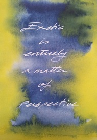
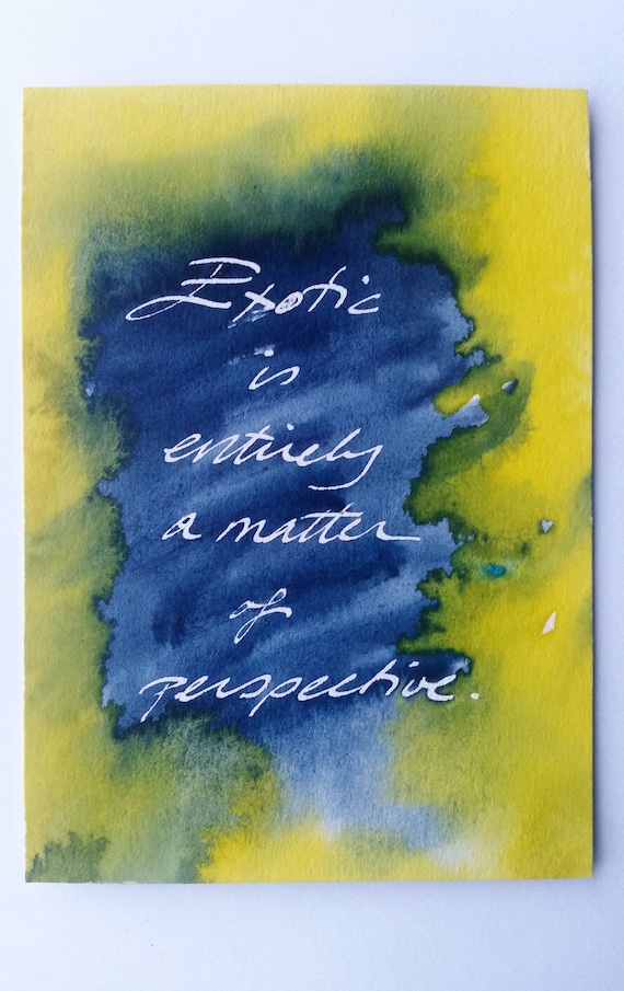
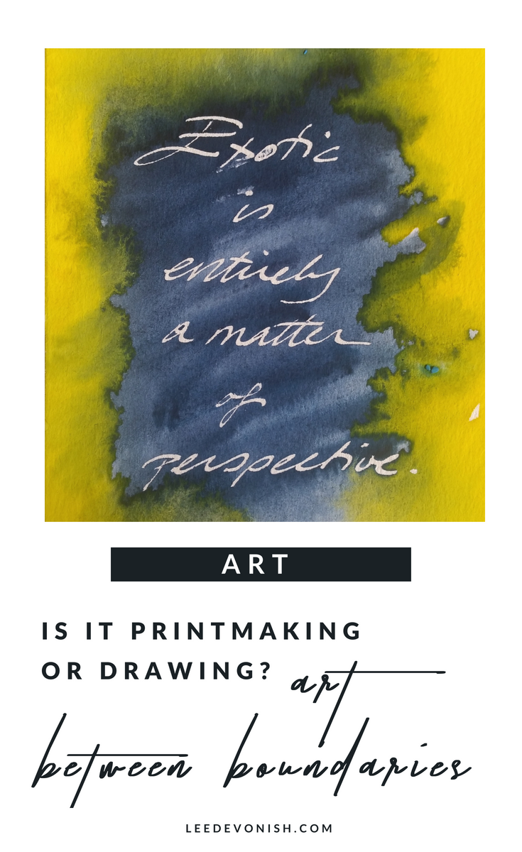
Exotic. Handwriting print by Lee Devonish, 2014
Exotic. Watercolour on paper, 2014

There are a limited number of prints, each one unique in its own way.


The process of drawing becoming printing

I think of these pictures as prints, although they are simultaneously drawings and paintings. Although they do not fit the mould of traditional printmaking, the work is approached as an edition, produced at the same time, and created by repetition of a specific process.

My handwriting is my specific graphic fingerprint, which is the same, yet different each time. This is repeated in the paint, the colours of which are the same each time, yet different, as the process of interaction varies across the surface.


Text in art and its associations

Of course, these are redolent of associations with Jenny Holzer, John Baldessari and Tracy Emin; for me, I like to think that they are the graphic link between the conceptually privileged thought/word and the thing/image.


Exotic?

The concept used in this example is something that I’ve batted around for years, and I know to be something that occurs to all people like me – people who have moved around the world and viewed it from new angles. The idea relies on the received notion of perspective, which should make it immaterial… but the word is a much heavier one than it should be.

It links to the idea of the words ‘immigrant’ and ‘expat’, and how we choose to assign these to people from different backgrounds.


How to buy:


Original prints are also available in my Etsy store.


‘Exotic’ is also available as part of my dissemination range from Zippi, where it is available as a print on a selection of items.

Print drawings are the overlap between drawing, handwriting, painting and printmaking. The printmaking or drawing process involves repetition and creates art between boundaries.


0