When I first started thinking about making an artist’s currency, way back in 2014, I thought about it both taking the form of coins and notes. Along the way, it was clear that most artists’ currencies take the form of notes, and it’s easy to understand why.
Notes are far, far simpler to make than a metal coin. The first banknotes were just written promises to pay a sum of money, after all.
Notes and coins are both immediately part of the language of money, but notes carry the connotation of high value. The exception is in the US, where their single dollar is still a paper note… but the US’s cultural capital is so strong that it’s made sure that the visual shorthand for money takes the form of a greenish paper bill.
So although I wanted to create both coins and notes, a paper bill had to form part of my currency, no question.
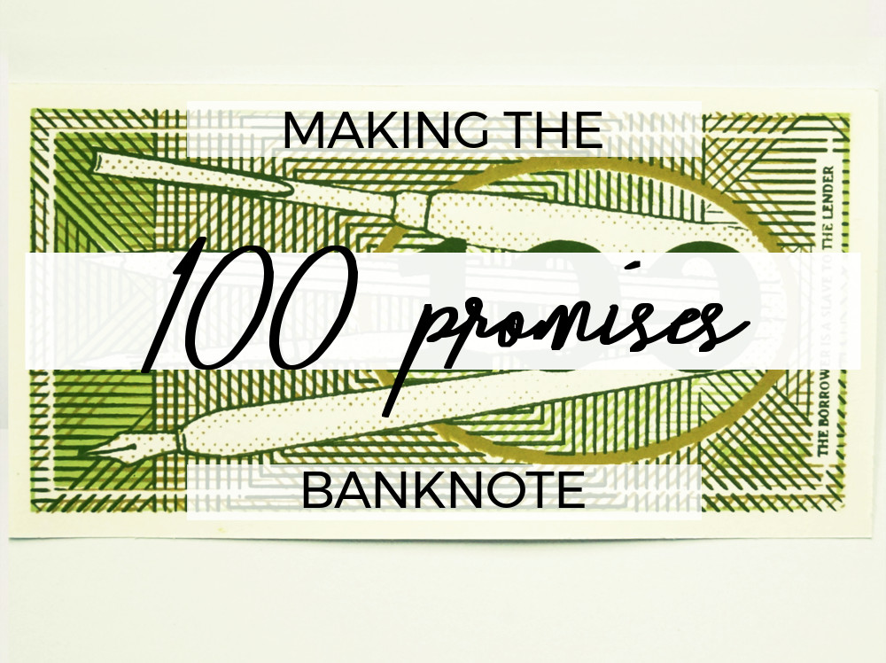
Why screen print the 100 banknote?
Printmaking is the technique that one would obviously turn to when aiming to reproduce currency – because there would have to be several of the same notes in “circulation” – and etching is the printmaking technique associated with banknotes and with money in general.
Just because I wanted to create a banknote didn’t mean I wanted to copy a banknote… I also wanted to evade expectations somewhat. Give a bit here to the accepted concept of money, take a bit away there.
Screen printing is a very interesting technique, as it can be dead simple or ultra-complicated. Multi-colour screen printing is difficult to perfect without a professional system for registration, so getting perfectly identical prints was always going to be near impossible. I liked the idea of the human touch coming through the attempt to mechanise the process, with all of the “flaws” – misregistrations, bleeds and fading – form an essential part of making each note an individual work of art.
Also, there’s the fact that I feel as though the medium of screen printing is part of my personal artistic practice. There are lots of things I like to do and to try, but only a few I think of as “what I do”: painting, screen printing, ceramics and sculpture.
Elements of the visual language of money: colour, shape and symbolism
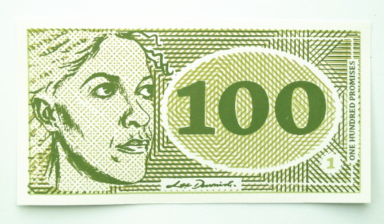
I stuck with the immediacy of green. For the first banknote I would make, I had to keep it simple; this is an artwork made to illustrate a concept, and it had to speak out the concept clearly.
Although I initially planned for the piece to take on an overall more pea-green, but not quite Kermit, tone, things got derailed one-third of the way through the printing. I decided to incorporate a more olive-toned palette
The same thing went for the shape and general format of the portrait. It may seem as though I was immediately working with lots of design constraints… but in the beginning stages I planned the note to be square, just to mess with our widely-held ideas of what money should look like. That just didn’t feel right though, so rectangular it was.
What I did particularly want to play with was the abstract patterning on the notes. I just love geometrical arrangements and started to experiment with the idea of optical mixing by overlaying printed acetate sheets in a kind of “lite” op-art.
Layering a couple of half-tone screens on top of each other gives each note a unique patterned effect, as each one can look very different from the other if the alignment is changed only slightly.
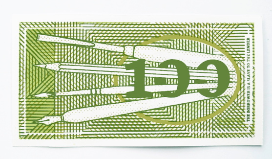
The back side of the note features four tools of the artist’s trade – the pen, brush, pencil and gouge, referencing the variety of media in which I work. I’ve taken on this motif as a kind of identifying crest, repeating it in my pewter 250 coin… and it’ll be a repeating feature in other coinage and notes.
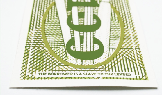
The back of the note features a quote from Proverbs 22:7, saying, “the borrower is a slave to the lender.”
The symbolism of 100
The denomination was always going to be important. As a central part of a larger body of work, this piece had to carry the anchoring number, and it had to relate closely to its value as an artwork – so in that sense, it chose its own denomination of one hundred.
One hundred what? This is the first of my money artworks to explicitly carry the name of my currency as “Promise”, although that is inferred as the title of my screen printed cheques.
Why promises? Well, the value of all currencies are in what they promise to give you in exchange. The money itself isn’t really any good to you; it’s what you can exchange it for when you need to exchange it. It’s the promise of transforming itself into something else, whether that’s a loaf of bread or a tank full of petrol.
If you have the nerve to put your face on something and assign it monetary value, then you’re making a lot of promises.
How it was made…
The images were mostly hand-drawn and repositioned by extremely old-fashioned cutting and pasting, with a lot of photocopying to resize. It’s left me with a sketchbook full of copied pieces and variations, which is interesting in itself.
Of course, I realised after doing most of this that I should have designed it all on a computer instead for pinpoint accuracy, but the fact is that the handcrafted element does reflect my personality and working style. Will I adapt to take on faster methods? Absolutely! But this piece has had a lot of hand-work put into it, which makes it special to me.
The piece is a 3-colour, double sided screen print, which is a technical challenge – 6 opportunities for something to go wrong! Actually, there were seven pulls in all on each note, as the note’s number is added afterwards with a separate screen.
Each colour had its own unique screen which was printed light to dark. Several different papers were tested for their colour and handle, but I selected a light cartridge for its bright white colour and flexible handle – the note is meant to be held as well as looked at!
Overall it was everything I enjoy in my work – a technical challenge and a deep concept to dive into.
Leave a Response