Tagged Painting

Fight

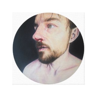
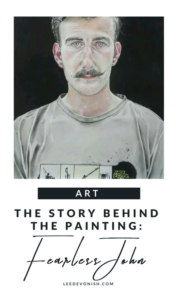
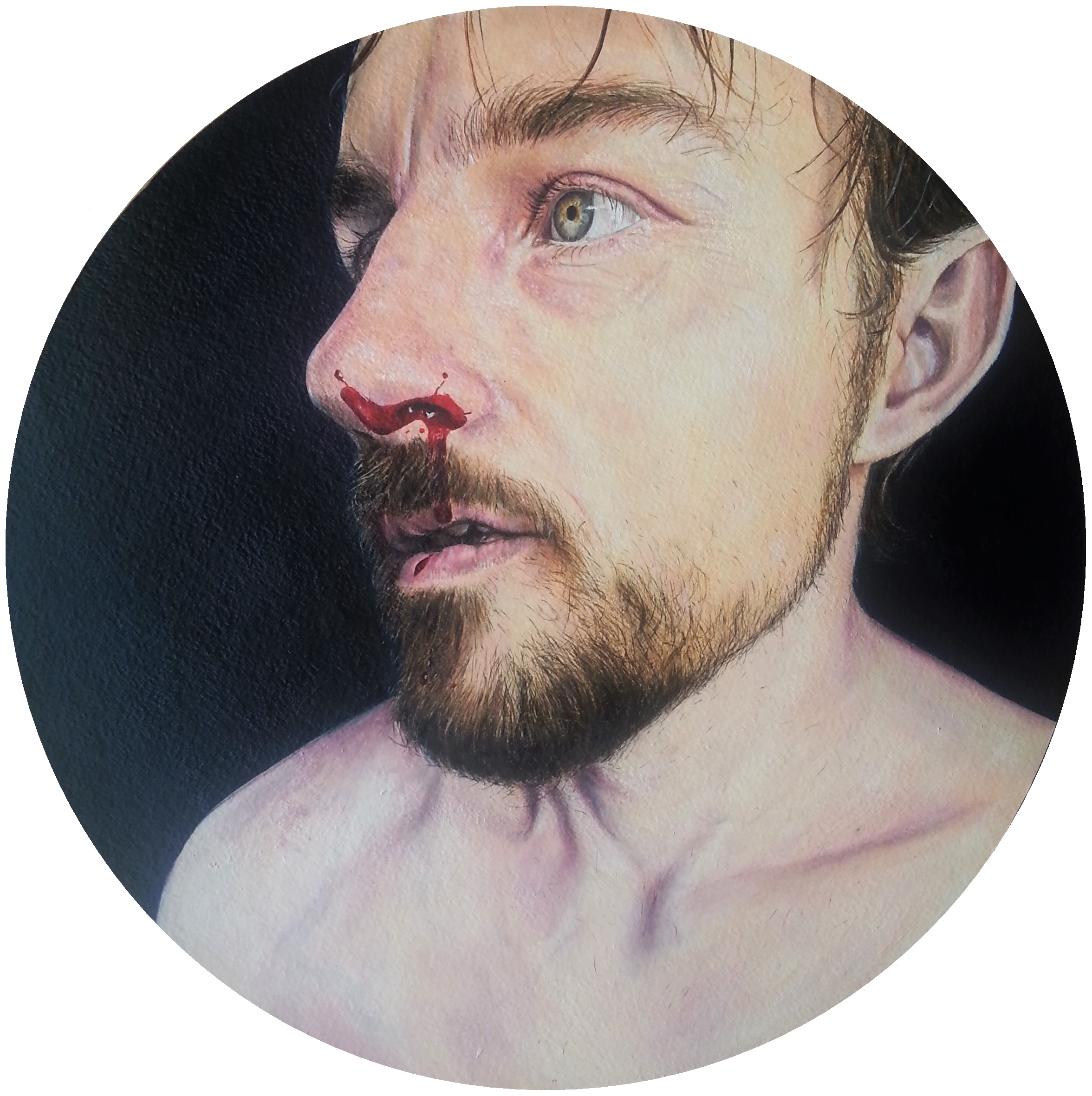
Fight – a painting about masculinity and vulnerability combined.

“Fight” encapsulates the conflict between the portrayal of outwardly brutal masculinity with the vulnerability of the body affected by violence.

Fight, oil on paper painting by Lee Devonish, 2016. Masculinity and vulnerability.
Fight. Oil on paper, 2016.

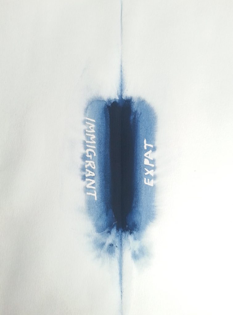
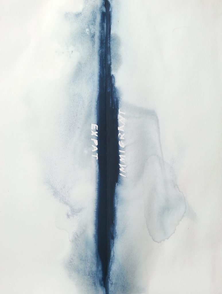
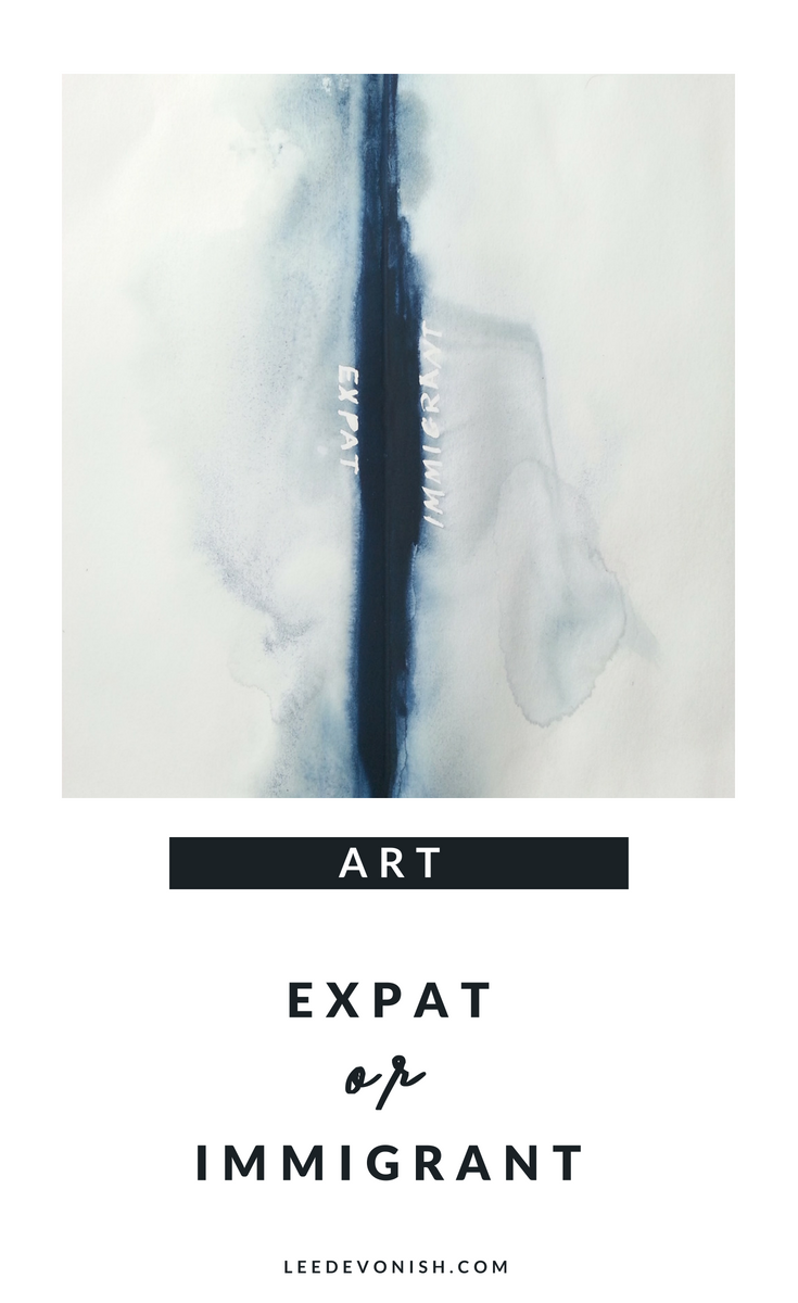
In/Out of the series

It is part of what I call the muscle series, but as a portrait it stands outside of the main body of the group, not depicting the body or muscularity.

The idea of the series is to look at the body under transformation – the product of a lot of very hard work in addition to any underlying capability.

Trauma

But this painting doesn’t focus on the body; instead, it focuses on the face and picks up on a point of apparent trauma. I could reveal the source of the injury, but perhaps it would be better to leave the air of mystery surrounding the event, with only the title to serve as a clue.

There’s clearly been some dramatic, violent event that has left its evidence, and it’s this visual punctuation that punches the macho façade of the strongman and shows vulnerability.

Movie men

But strength and vulnerability in men as depicted in visual culture are strangely contradictory, as often the transcending, larger-than-life heroes of the cheesiest action movies are the ones who are physically pummelled and beaten to ragged, bloody shreds. (Yes, I’m a child of the 80’s.) I wondered if women found these male types appealing as they are softened by pain and suffering, and if men also found these types appealing because of their transcendence over pain and suffering – it’ll likely be a combination.

It later occurred to me that some men just like to fight.

Masculinity and vulnerability

So this picture grew from the concept of fighting for the purpose of acting out that “hero masculinity” – seeking out and wearing wounds to display strength to society.

It’s now available in my store, and some prints are available at Zazzle.


Muse 4.3 (The Ear)

Muse 4.3 (The Ear)

I came up with the idea for the series of paintings that I’d call ‘The Muses’ whilst studying for my BA in Fine Art in 2012. Muse #4 was the subject of several paintings and drawings, but this one, 4.3, is one of my favourites.


Let’s face it – there’s a sense of power in looking when the subject cannot look back. How much more so is that true in a situation where the one looking is allowed to get this close… too close… to an unguarded point on the body?

Creepy. That’s what’s good about it.


Influence – Ellen Altfest

There were all sorts of influences flying around me at the time, as there naturally are in art school, but for these, I was particularly guided by Ellen Altfest and a trip to see her exhibition The Bent Leg at the White Cube in Hoxton. (Quite a lot of capital letters in that sentence – comes across a bit pretentious!)

There’s a clear link between Altfest’s tightly cropped images of male body parts and the portraits (and male body parts) that I created for my degree show. Seeing the detail she clearly laboured over up close made me want to dive into that painstaking labour process as well, although I could imagine that the experience was hallucinatory. Actually, I might have read that phrase somewhere in my research – either that, or I’m hallucinating the hallucination reference, which is entirely possible.

The exhibition, which was part of a class outing,  was a very encouraging experience for me as the only figurative painter in the group and the only one concerned with representational painting and hyperrealism. Seeing a female artist’s paintings of male subjects created in exactly the same manner as I’d intended to, with a focus so sharp it verged on the unreal, well, I suppose it was validating.


Muse 4.3 Oil on board painting by Lee Devonish


The White Cube kindly let me use some of the images for my dissertation on the male nude, which also referenced Ellen Altfest as well as Sylvia Sleigh.


Gendering

I suppose I’d have to ask myself now, what part of the ear suggests masculinity? It’s not the ear so much as the surrounding hair and the haircut which frames this part as belonging to one gender or another. Now that answer could take me off on another hair-related tangent, but it’s safe to say that hair is still a subject I find interesting.

Whilst it was the hair, and responding to Altfest’s detailed layering of hairs that I was preoccupied with at the time, now I am more drawn to the fleshiness and folds of the ear itself. This was just a starting point for the work ahead. My future paintings will probably owe their ‘intensity of looking’ to this series, and to this picture in particular, the closest image of them all.


This painting will be available to purchase from my Etsy store.

A postcard of this painting is also available on Zazzle – click here to view.


Fearless John

Fearless John – the story behind a watercolour painting.

I was walking through a shopping centre in Ashford one day in the summer between terms at art school when something caught my eye.

There was something strange about the young man working at the mobile phone kiosk – I’d already walked by when my brain finally worked out that it was the handlebar moustache he sported.


Fearless John, watercolour painting by Lee Devonish, 2011 | handlebar moustache painting
Fearless John. Watercolour on paper, 2011.


A handlebar moustache painting was already on my mind…

I’d never seen anyone so young wearing a moustache like that, so carefully curled. It stood out to me because I’d been thinking about male facial hair a lot at the time, as part of a project on gender signifiers. (At the time, I was pretty oblivious to trends. I didn’t have a tv and I had no interest in fashion: both still true. I didn’t realise that soon, handlebar moustaches would be on everyone, even as jewellery and clothing prints on those who couldn’t grow them.)

After I got home, I started to regret not asking the stranger if I could paint his portrait.


It’s more than a bit strange, sure, but I decided to ask the next time I saw him, if there was ever a next time.


Of course, I did see him the very next time I went into town, but this time I was armed with my camera and business card to prove I wasn’t just a nutter. He was actually quite happy to be painted, which was a relief in that situation! I took my picture and scurried away as fast as I could.


Discovering my mystery model’s identity

After the term had started, one of my classmates saw my painting and recognised my subject as one of her friends and told me his name – John. I’d actually aged him up a bit. I now had a name (and a title) for my painting.

Still, he was very pleased with the result when I carried the painting down to the shopping centre to show him. That’s the last I saw of John.


The story behind this painting: Fearless John | watercolour handlebar moustache painting | portrait of a man

This artwork is available as a postcard here.


Expat Or Immigrant

Expat or immigrant?

Both are the same, of course, and I am both at once… but which word do you choose, and for whom? Your dominant affiliation will answer – how you see yourself and your authority in the world, and the authority of your country of origin vs the country you go to.

However, the history of the words and their applications carries much more than a personal choice.


Racism embedded in language

Many people think, with good reason, that the term “expat” has become synonymous with white migrant workers, whilst “immigrant” has been reserved for people of colour who go overseas to work. There’s more at work than just race. There’s nationalism and wealth to consider when we think of expat or immigrant.


Expat or immigrant - art about migration and how we describe immigrants. Expat 1. Watercolour on paper by Lee Devonish, 2016
Expat 1. Watercolour on paper, 2016.


Hierarchies of words

The words don’t need to carry these meanings, but they’re reinforced by the way we repeatedly address the hierarchical relationships between rich and poor, coloniser and colonised, expat and immigrant.


What feels even more strange is the way that we migrants – immigrants or emigrants – refer to ourselves. As a Bajan abroad, I’ve always thought of myself as an immigrant. I learned to frame my self in relation to my new country, not my old one, even though I carried my old culture around with me and only ever saw my travels as a temporary measure at the start.


It’s the weight of culture that tells us that we are immigrants when we go to a bigger, richer country. Perhaps it’s time to start defining ourselves as emigrants or expats in our choice of language and letting that seep into our identities.


Expat vs immigrant. A work of art about the difference between words. Expat 2 - watercolour on paper by Lee Devonish, 2016.
Expat 2. Watercolour on paper, 2016.

Using art to talk about the expat vs immigrant relationship

Instead of using words to fight words, I’ve used another language to discuss this hierarchical relationship.

Fitting the medium to the message of immigration

Instead of treating these paintings with reverence, I’ve purposed them to be disseminated widely. They will only be available through print-on-demand platforms, and their imagery will be placed on somewhat incongruous surfaces for mass consumption.


Visit my dissemination experiment here: Expat 1 / Expat 2


Expat vs Immigrant Canvas Art
Canvas print available on Zippi
Expat or immigrant - who gets to decide which word to use? Both are the same, and I am both at once, but which do you choose to describe a migrant, and why?

Concept/Word/Image

Concept/Word/Image:

A few years ago, I wrote an essay entitled “The Thought That Counts”, on hierarchical dualisms within academic and non-academic modes of thought.

In it, I tried to address all manner of subjects including conceptualism, craft, feminism and graphic novels, linking these through similarities within oppositional pairings.

The sprawling project did earn me my Master’s degree but also helped me to address my own practice, in the way in which I became interested in binding thought, language and writing with the image.

Mixing it all together

Personally, I’ve come to re-think my previous work on the gendered gaze, or the male as recipient of the gendered gaze, and try to combine visual and textual elements to be read as equal signifiers… or ignored, at the viewer’s pleasure.

The visual representation of thought is a concrete device of the graphic novel that I want to transport to the realm of the single-frame ‘fine’ art piece.


Sketchbook doodle by Lee Devonish, 2015

Why watercolour?

I’ve chosen watercolour for this kind of work precisely for its unfashionable status and attachment to now-repugnant understandings of art and middle-class respectability. (Think twee cottages and greetings cards.) There’s also the matter of its legibility – it’s familiar and understandable, and downright gorgeous at times.

What’s next?

I don’t know.

As my work continues I hope for it to provoke some internal discussion over the remaining hierarchical structures surrounding concept, word and image – will it actually succeed? .


0