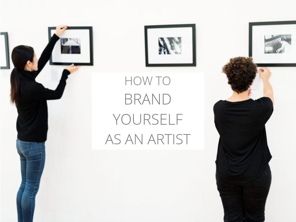
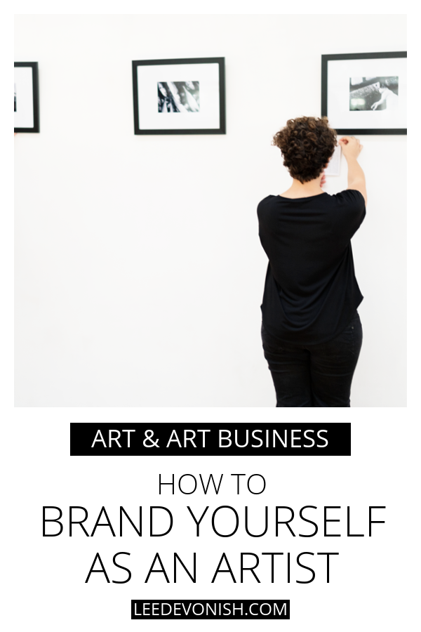
How to brand yourself as an artist - it can be hard to decide on a tone of voice for your personal branding as an artist. Here are some art branding tips.
This post contains affiliate links, marked by an *
Branding yourself as an artist is a big deal – there are lots of articles floating around that will tell you how to brand yourself as an artist with streamlined visuals, typefaces and marketing materials, but that doesn’t always cut through to the deeper part of branding.
Besides that, it doesn’t address the underlying insecurity you may be feeling about yourself as “a brand”, and who you want that brand to appeal to.
How should you brand yourself as an artist? Not just your superficial appearance, but your tone? Should you pitch yourself as serious, approachable, academic or fun? Basically, you want to know how to position yourself.
You’ll hate me if I say there’s no right answer – we want answers!
It all comes down to what you want – whether it’s to get more pet portrait commissions or to get a residency at the Tate – your branding should:
- take you in the direction you want to go.
- be sustainable – not something you can’t see yourself keeping up.
- make you happy.
Compare and contrast
To make things easier, draw up a list of three contemporary working artists whose work, outlook and goals you admire and identify with. Then draw up a list of three contemporary working artists about whose work you feel the opposite way.
Visit each of their websites and make bullet points of what you do like and what you dislike – for each artist. Try to find good and bad in each, whether you put them in the first or second list.
Then look at your own branding and ask how you can apply your likes and dislikes to yourself.
Use art history
One good thing about the way we’ve compartmentalised art history is that it makes it very easy to categorise artists. That’s not exactly beneficial for art criticism but it sure is good for branding!
Think about how artists who are relevant to your work have been presented, and how you can use elements of that to position yourself as being of a like style.
Now let’s get into some of the nitty gritty.
Let’s talk about presentation and audiences.
The problem is, it’s not as easy as saying, “just be yourself”, because we’re often many things at once, and you’re probably worried about choosing the wrong tone and alienating your potential customers or even your peers.
But here’s the thing: whatever audience you choose to court, you will alienate another. You cannot please everyone, but you can wear yourself out trying to.
No matter how good you are, not everyone will like what you have to offer… the sooner you accept that, the sooner you will be able to focus on the audience that will love what you have to offer.
Don’t believe me? Just think about the times that the critics have got it wrong.
Yes, the established “masters” have face rejection in their day, but on the other hand, even the worst, weakest art has its fans. Die-hard fans. That’s the truth. You can keep on looking over your shoulder to see who’s pointing and laughing at you, or you can look at the potential artwork in front of you.
The grass is always greener
Here’s another thing: whatever you choose, you’ll probably find yourself worrying about the audiences that you think you’re missing out on. The abstract artist who thinks that the figurative painters are picking up all the commissions, the figurative painter who’s jealous that the socially engaged artist is snapping up all the public projects, and the socially engaged artist who thinks they should start making some abstract paintings so they can have a chance of selling.
However… we tend to forget that hardly any of us like only one kind of thing, or that there are very few “either-or” choices in art or in life.
I like the honest vulnerability of Rocky I, but I like the smothering 80s propaganda cheese of Rocky IV. They are different things that perform different functions, and I like them both for different reasons.
So let’s think about some questions that apply specifically to an artist’s brand.
Do you need to sound like an academic?
Artists who fit into academia usually feel at home with institutional critique, enjoy writing, researching and applying theory and philosophy to their work and reviewing others’ work within a framework of formal values.
For artists who also work as educators, those who seek out residencies and work with art institutions, and who want to relate primarily to other professional artists – you’re mostly preaching to the choir and don’t have to backtrack on the lingo… you know what I mean.
Still, you should cut out the artspeak gobbledegook from your artist’s statement. It won’t make you seem any more established than you actually are, isn’t necessary to get your point across, and is becoming very unfashionable.
If your business model involves selling your art to the public, it’s even more important to consider how you communicate to them. An art school crit will go over most people’s heads, and not in an impressive way.
Some people will dislike what you do and call it “intellectual crap” – either because they feel a bit insecure or because it genuinely is crap. If your intellectual crap springs from your very soul, then by all means spout it. If it’s just copypasta, then bin it.
Just say what you’re doing, how you’re doing it and why.
Should you have a separate brand name?
Fine art tends to revolve around the mythical idea of genius and thus privileges the individual artist’s persona – this is true even when considering collaborative duos.
Artists do often use pseudonyms and alter egos as a way of separating themselves from their professional selves – or maybe protecting themselves – but this is still a way of branding an individual, not an art business.
Artist collaboratives are a bit of an exception to this principle, but they still operate in the space of “artist as creative” instead of “artist as business”.
Artists who prefer to brand themselves as a business with a separate brand name are usually pitching towards a more commercial market, whether it’s seeking commissions or selling products or lessons. If you brand yourself this way then it’s harder to pitch yourself as a “serious” artist without pivoting and reverting to your own name or another name.
That’s not to say that you can’t use a business brand name as a fine artist, but you’ll have to either approach it with utter confidence or a kilo of straight-outta-art-school irony. And stay far away from anything “cutesy”.
What if your art is cutesy?
Well then, be your cutesy self. But own it.
Visual language matters online
When it comes to styling your website, you may feel overwhelmed at the variety of themes and visual elements available. So make it easy on yourself and think about the existing visual language that surrounds your preferred style.
Chances are that the art you’re making has some kind of historical precedent from which you can draw, so look at how similar artworks have been presented in real life. White walls? Baroque settings? Real life cues can help you figure out how to frame your work online.
Just don’t go partying like it’s 1999. Ugly websites belong in the past. Don’t stick your work in an ugly online gallery.
If in any doubt, just go minimal and let your artwork do the shouting. Most people won’t expect an artist – particularly a self-representing artist – to have a corporate-perfection style site. As long as your work takes the centre stage and there are no glaringly distracting elements, you’re off to a good start.
What kind of website do you need?
I always suggest using a top level domain (TLD) that you own, rather than a subdomain of another site. It simply looks more professional and gives you more control over what you allow on your site.
However, if you’re broke or just can’t face anything technical at all, then by all means go for the free option and upgrade later. Just don’t go for a free option that involves you advertising the hosting company or displaying ads that you can’t control.
For artists, using a .com isn’t as big a deal as it may be for other businesses. There are lots of interesting and weird TLDs out there now, and if you can’t find your name as a .com, you might be able to find it as a .art, .ink or .design.
Let’s talk about typefaces
It’s time to be humble – just because you’re good at your artwork doesn’t mean you’ll be good at design. Let’s give graphic designers their due here.
There’s a lot that goes into selecting a font for a big brand, because the visual cues work alongside the words to communicate all the things that the words alone can’t. You may not be able to articulate all of that without hiring a designer, but it’s fairly easy to pick out the typefaces that won’t work for you, and steer clear of them.
By that, I mean that there’s no excuse for using Comic Sans anywhere near your art.
I’ve compiled lists of my favourite fonts for painting, drawing and printmaking, with more to come.
Here are some ideas for typefaces that might fit your artwork if you did block printing, for example:

Hopefully this illustrates that there are lots of options for translating some of your artistic style into text. These can be purchased from Creative Market* – click on the images to go to each one.
Do you need a logo?
Probably not. Unless you’re branding yourself as an art business or are pushing your art blog as a business in itself, then a logo isn’t a necessity and could actually detract from your brand.
As an artist, you are the brand, and when you incorporate a logo into that, then you’re folding the commercial history of logos into your work. If your work has that commercial / street art edge, then go for it. If not, then don’t. For most artists, their signature does the work that a logo would do for a commercial brand.
You may be able to do a lot of the work of a logo with an appropriate typeface (see above). If do need to have a logo designed, look through some portfolios on Fiverr* to find a designer whose work you admire.
What should you blog about?
This is a bit of a prickly one – you can blog about your art, your life, your inspiration – anything really. You just need to consider your tone of voice and the fact that whatever you say, you want to come across as trustworthy and professional – never nasty or petty.
I’m sure that most of your readers won’t care if you put up the occasional picture of your cat, but if there’s never any art on your art blog? That would be weird.
Have a look at my post on blogging for artists for more info – I’ll be updating this regularly as well.
Should you put ads on your site?
This is entirely up to you, but be aware that the more high-end your market, the more incongruous any ads will look.
I think that many will disagree with me, but I will say that ads aren’t necessarily entirely bad, especially if you need your website to contribute to your art (this is the real world, after all, and artists have bills to pay), but too many ads are definitely bad.
Even an ardent admirer would be put off by a site that was slow to load because of being loaded down by ads.
Affiliate links in a blog post are more subtle than display ads, and if you have enough traffic to your site to make money from display ads, then you have enough for affiliate marketing* instead.
Keeping it real in your branding
It’s very easy to feel as though purposeful branding is snobbish, but it doesn’t have to be. Artists’ statements can be full of obfuscating artspeak, but again, they don’t have to be. It just happens because we feel as though we have to keep up with the ArtJoneses.
What you want to achieve is something that reflects you and your work.
What to do if you get it wrong
Just change it! Big corporations rebrand all of the time, and despite having millions of bucks behind them and an army of outsourced agencies, they sometimes get it wrong.
You will get it wrong, but look at it in the way that you look at your artwork – keep on refining, keep on growing and keep on responding to your growth.
Leave a Response